
Project Background
Cleaning Beyond the Surface
Not all Cleaning is Always Truly Clean
Most homes, offices, and apartments rely on routine or surface-level cleaning that leaves behind hidden dirt, germs, and cluttered spaces. This creates environments that may look tidy on the outside but lack true freshness, hygiene, and order. Traditional cleaning services often fail to combine deep care, professionalism, and consistency, leaving clients dissatisfied and spaces falling short of their full potential.
Surnis exists to solve this problem, delivering deep, refined cleaning and space maintenance that goes beyond appearance, creating environments that inspire well-being, productivity, and peace of mind.
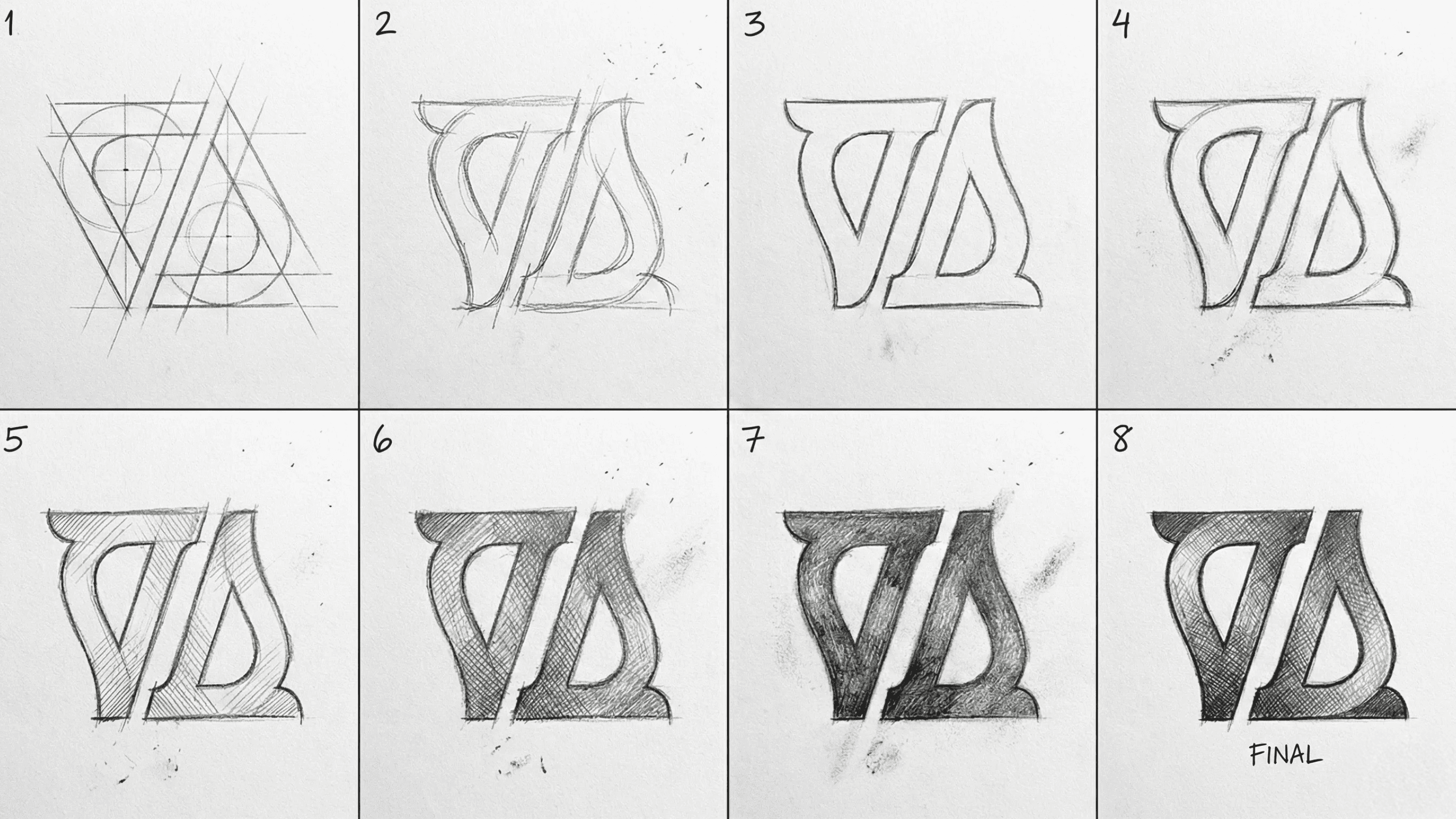
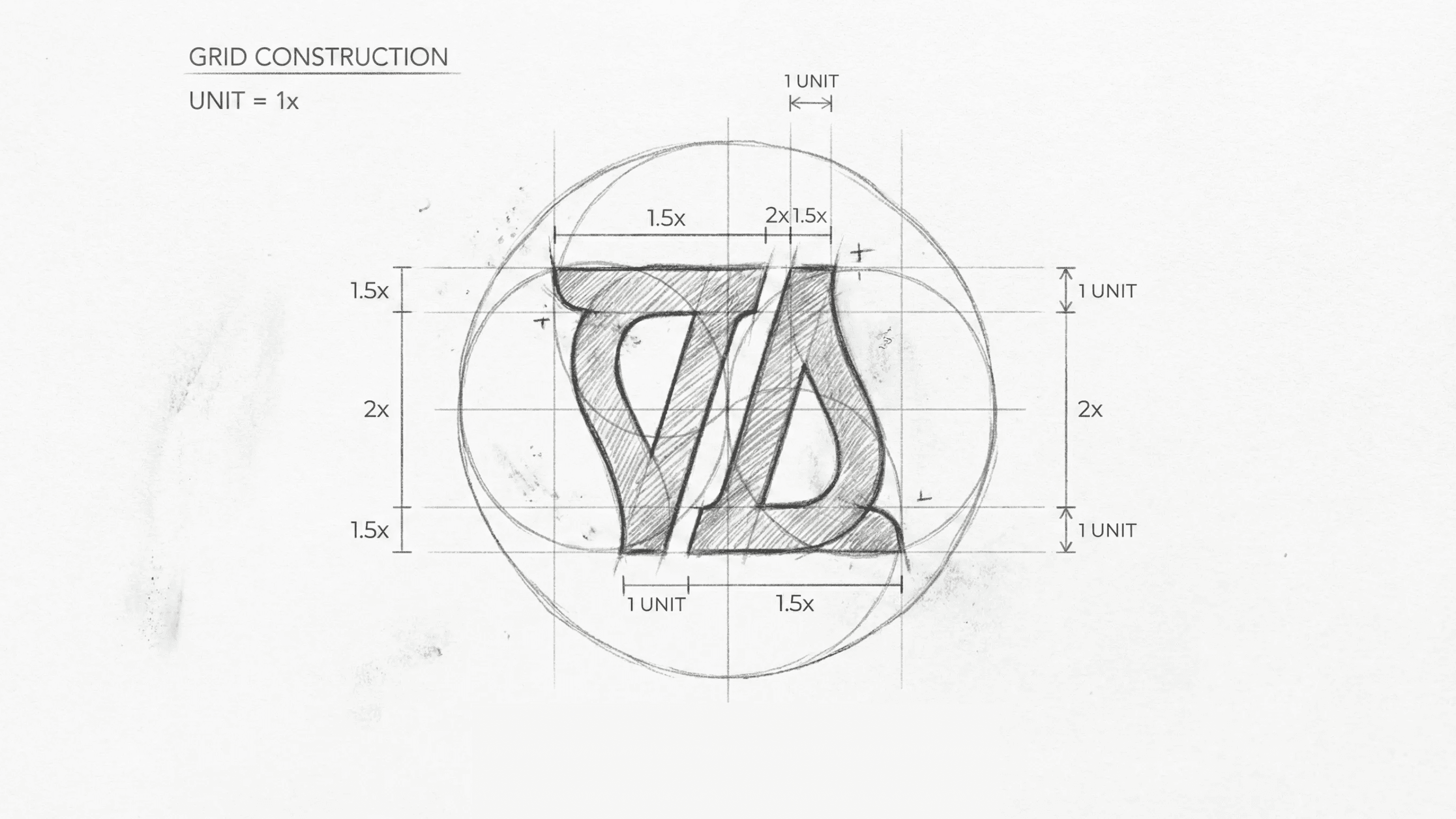
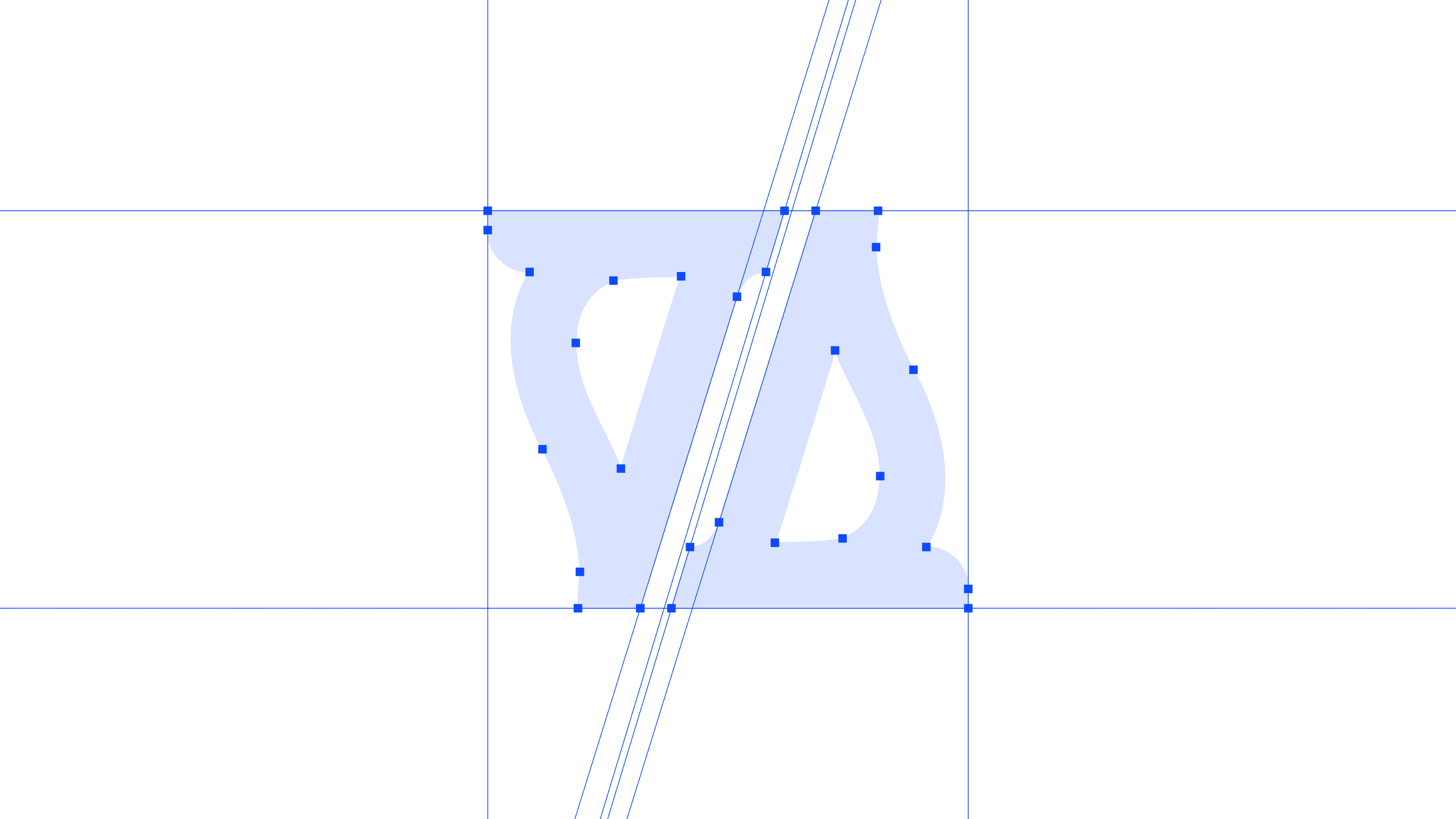
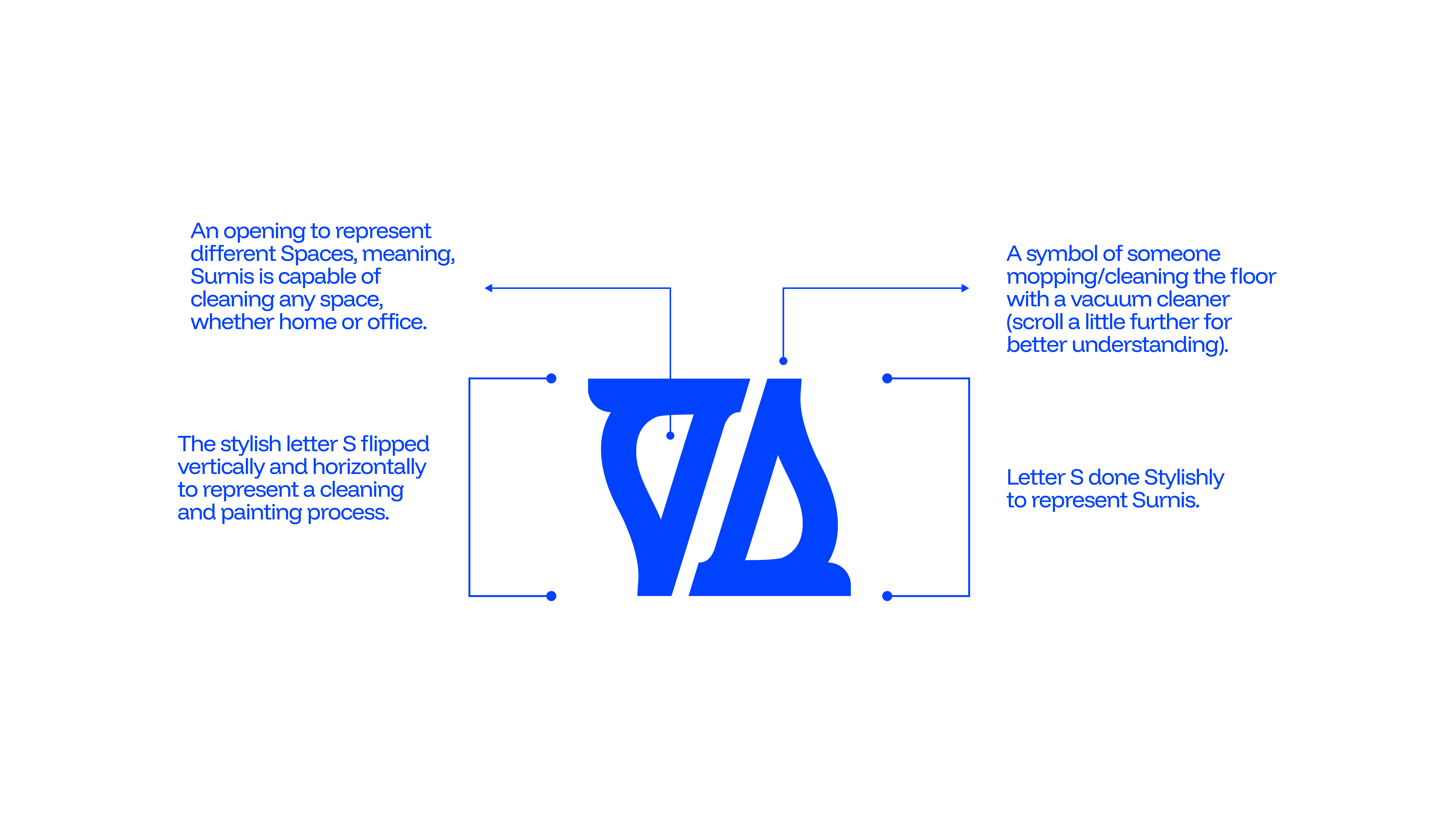
The logomark wasn’t just designed, it was engineered with style. Built on a clean grid system, every curve and angle was proportionally balanced, giving it that sleek, modern feel while still keeping a sense of warmth and approachability, and it’s precision meeting personality.


Objectives
Cleaning Beyond the Surface
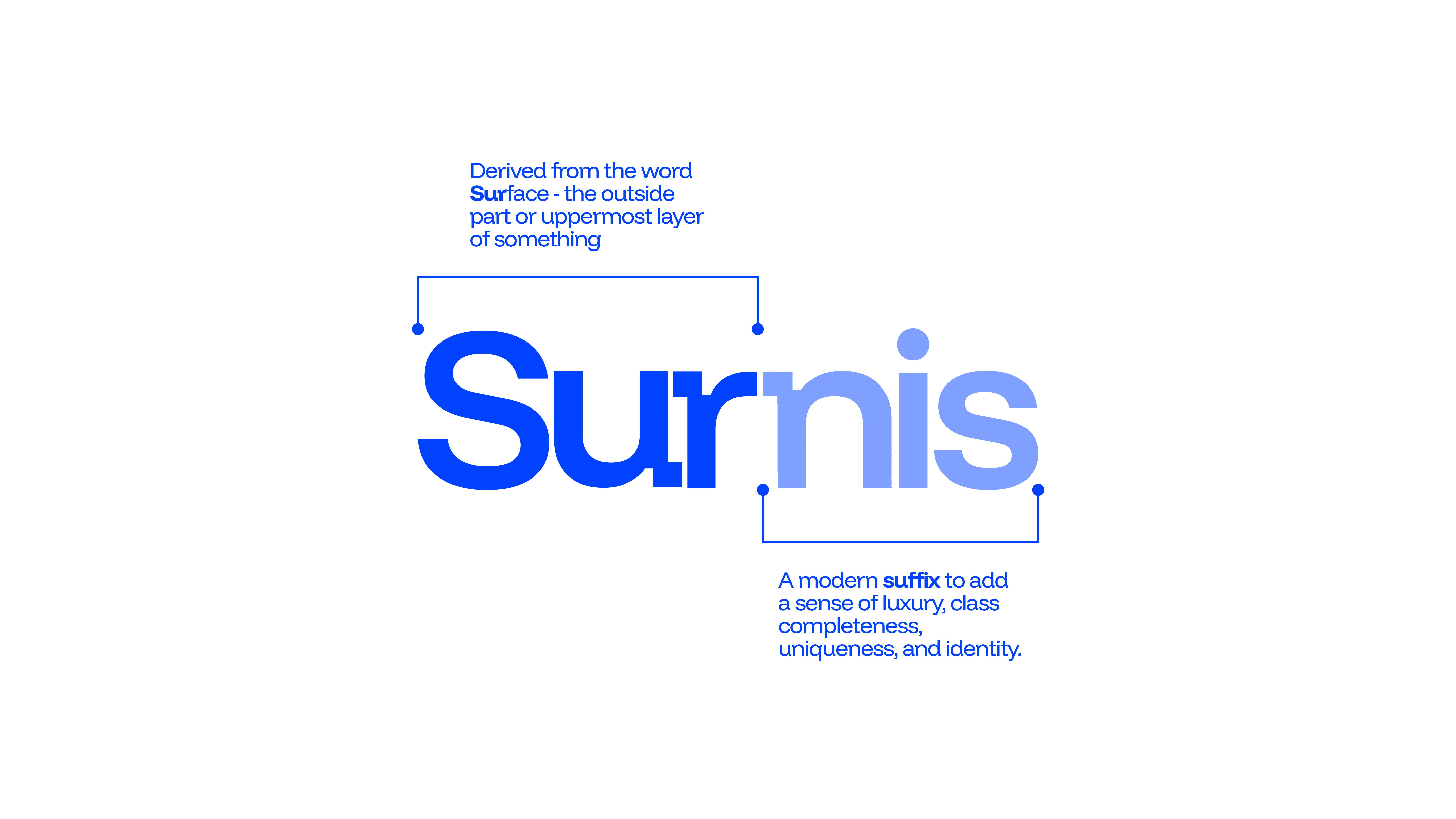
The name Surnis was born from the idea of surpassing the ordinary in space care, derived from “sur” (above, beyond, "surface") and a refined suffix that gives it a sleek, modern identity. It represents a brand built not just to clean, but to elevate every environment into a space of serenity, health, and inspiration.
Surnis goal is to redefine how people experience cleanliness, transforming it from a task into a lifestyle standard. Through innovation, precision, and eco-conscious practices, Surnis aspires to become the leading name in deep cleaning and maintenance, trusted to create homes, offices, and apartments that embody comfort, productivity, and peace of mind.


Our Approach
A Brand Built to Shine
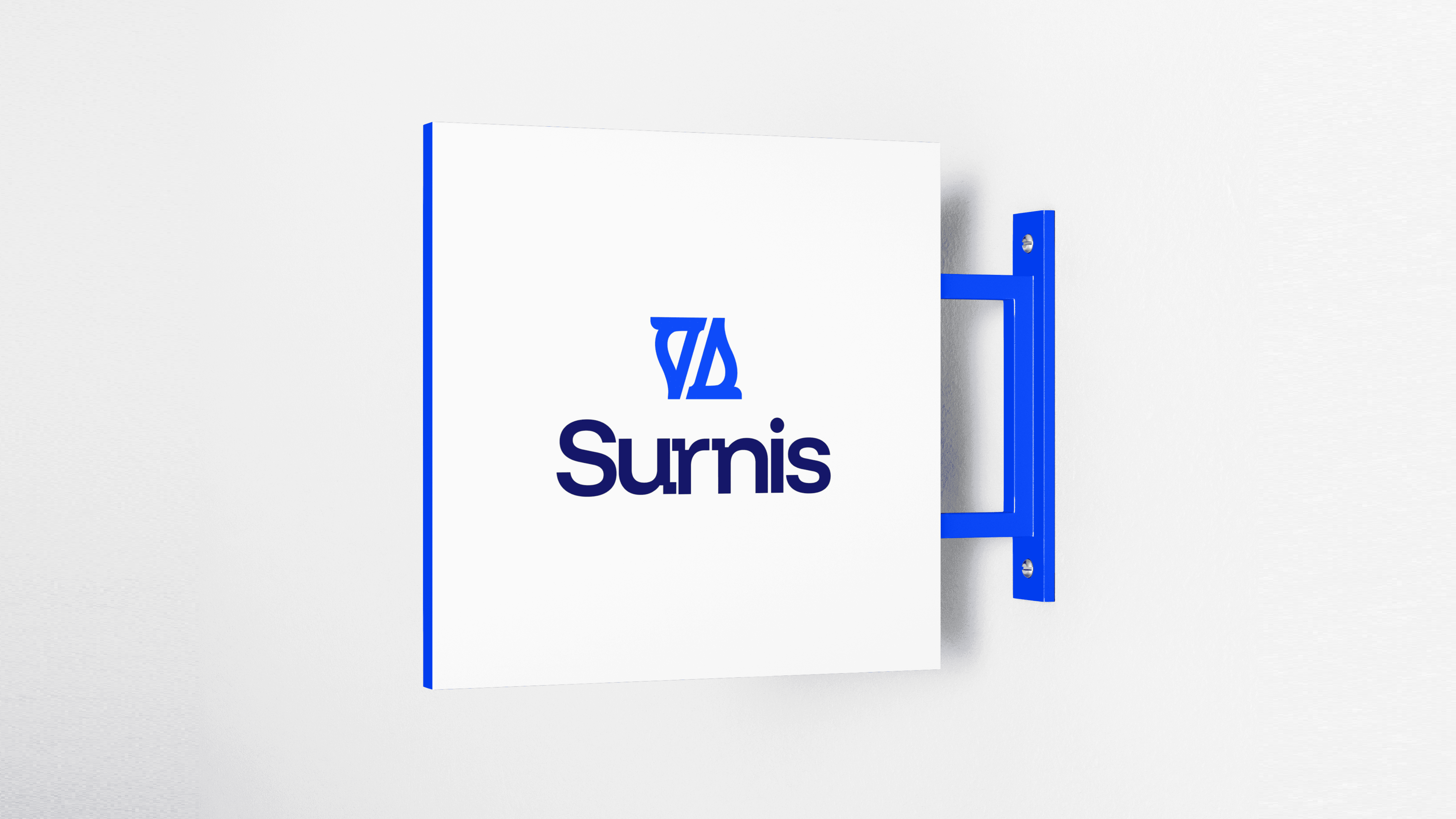
Surnis responds to the need for true, deep cleanliness by establishing itself as more than a service provider, it becomes a symbol of refinement, trust, and elevated living. The branding and design system were developed to reflect this mission: clean lines, balanced typography, and a modern logomark that subtly embodies transformation and space care.
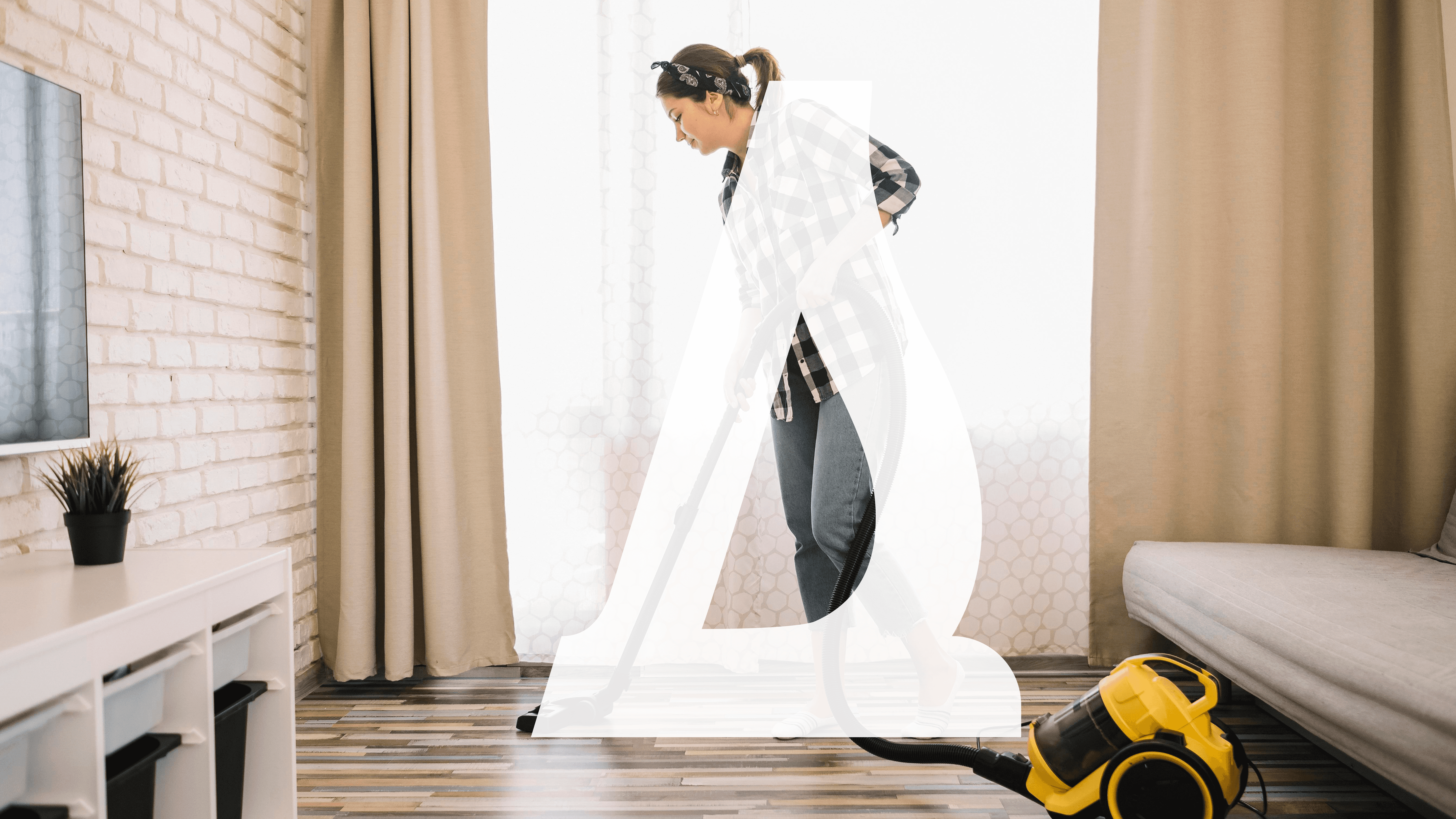
The logo, with its stylized “S” forms and open structure, visually represents versatility, renewal, and the act of cleaning across different spaces. Yet, it is the overall identity, colour choices that convey freshness and professionalism, typography refined for clarity and harmony, and a consistent brand voice, that communicates Surnis’ promise of precision and care.
This design solution ensures that every brand touchpoint, from logo to messaging, reinforces Surnis as a premium, dependable partner in maintaining spaces that inspire well-being, productivity, and peace of mind.
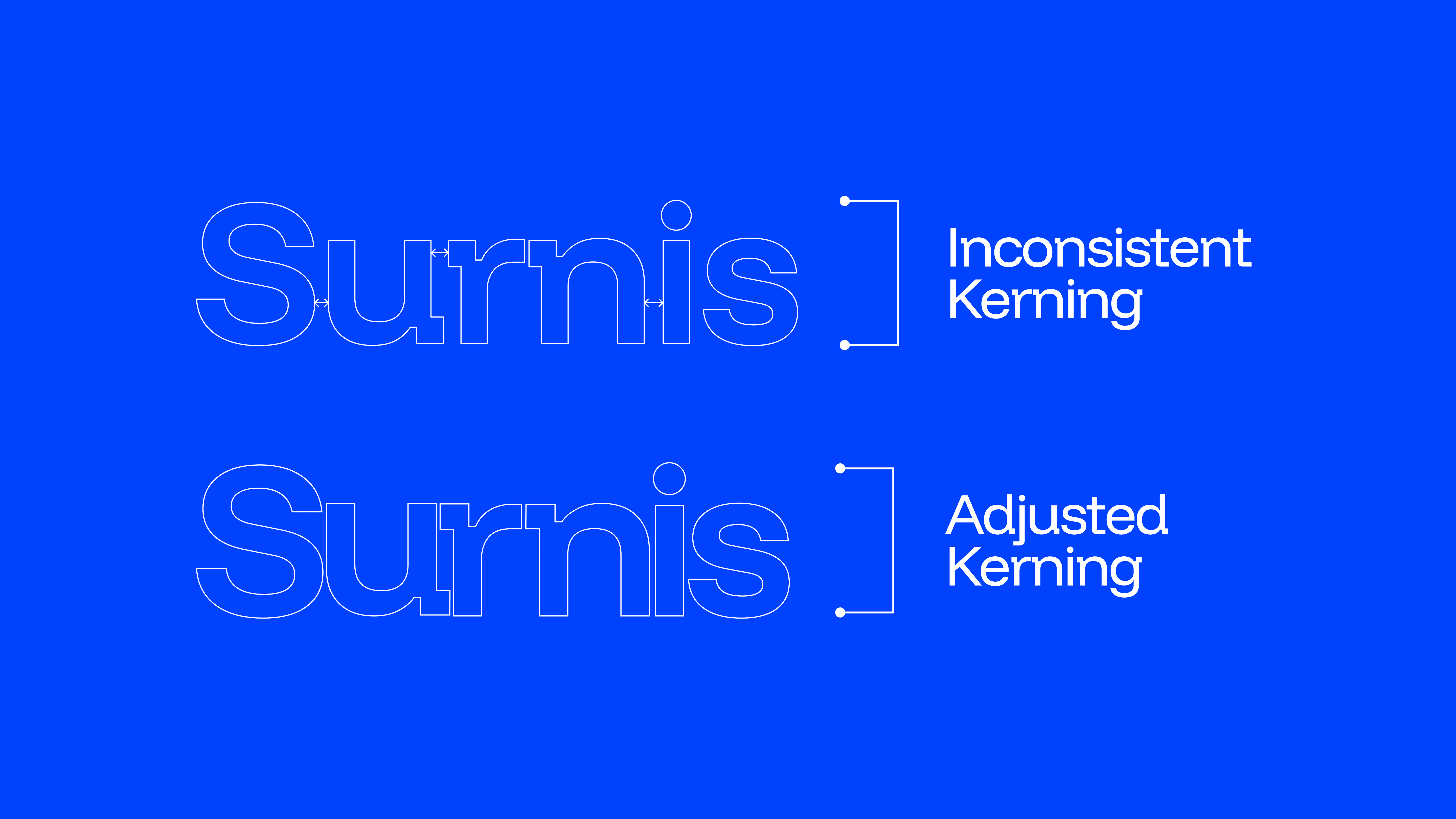
The initial typeface selected for the wordmark presented inconsistencies in its kerning, which disrupted the overall balance and readability of the logo. To resolve this, adjustments were carefully made to the spacing between letters, ensuring uniformity and harmony across the entire wordmark. This refinement not only improved legibility but also enhanced the brand’s professional and modern appearance, aligning with Surnis’ identity as a clean and precise service.
Moving on, while refining the typeface, we observed that the natural spacing between the letters r and n created an interesting opportunity to add extra story and depth to the brand identity. That subtle gap hinted at a home entrance, building and a residential space, qualities that align with the idea and core value preposition of Surnis. However, the font in its raw form, lacked precision and balance. To resolve this, we made a quick but intentional adjustment, ensuring the spacing felt purposeful and harmonious, while also reinforcing the brand’s refined and thoughtful character.
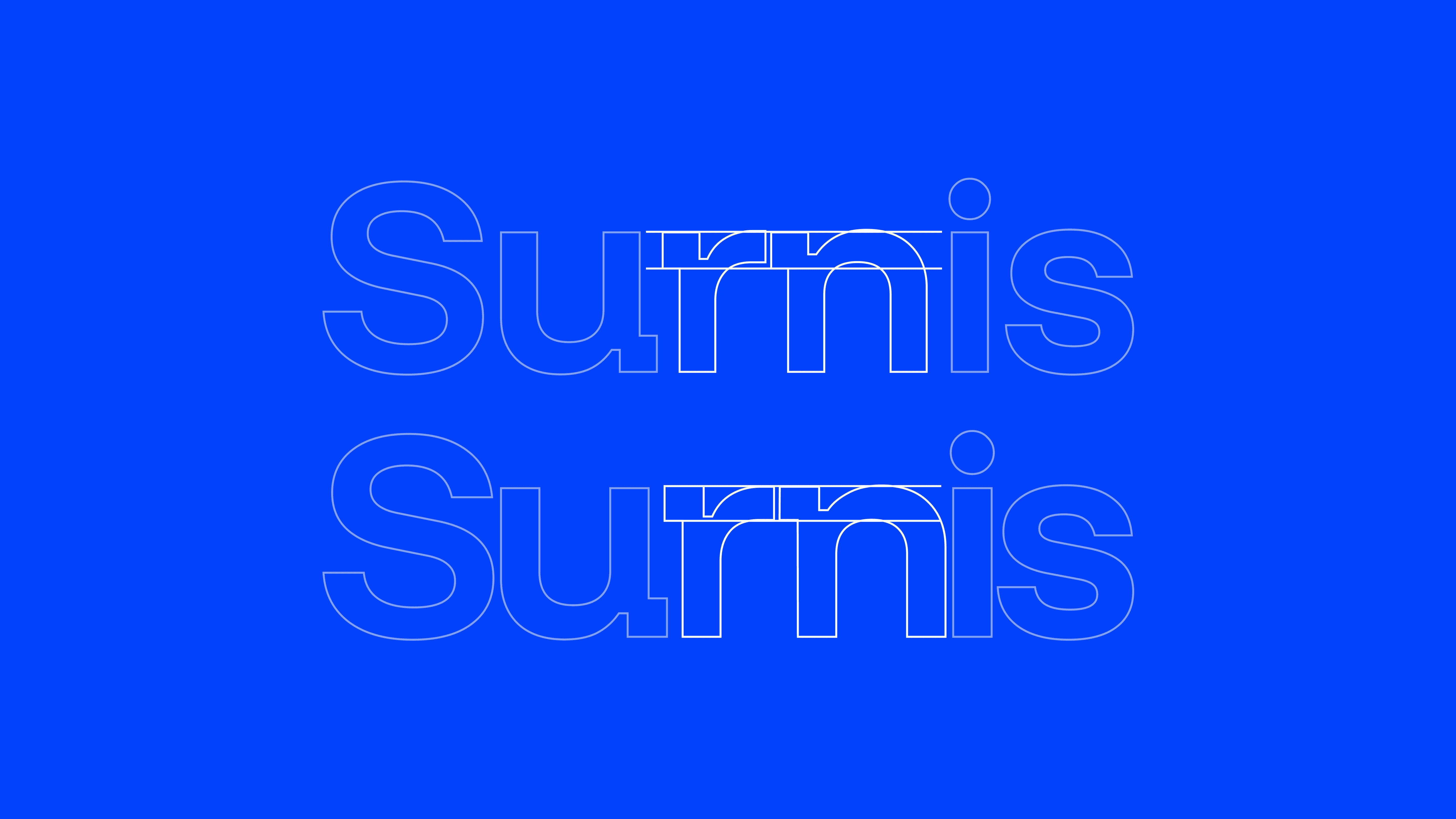
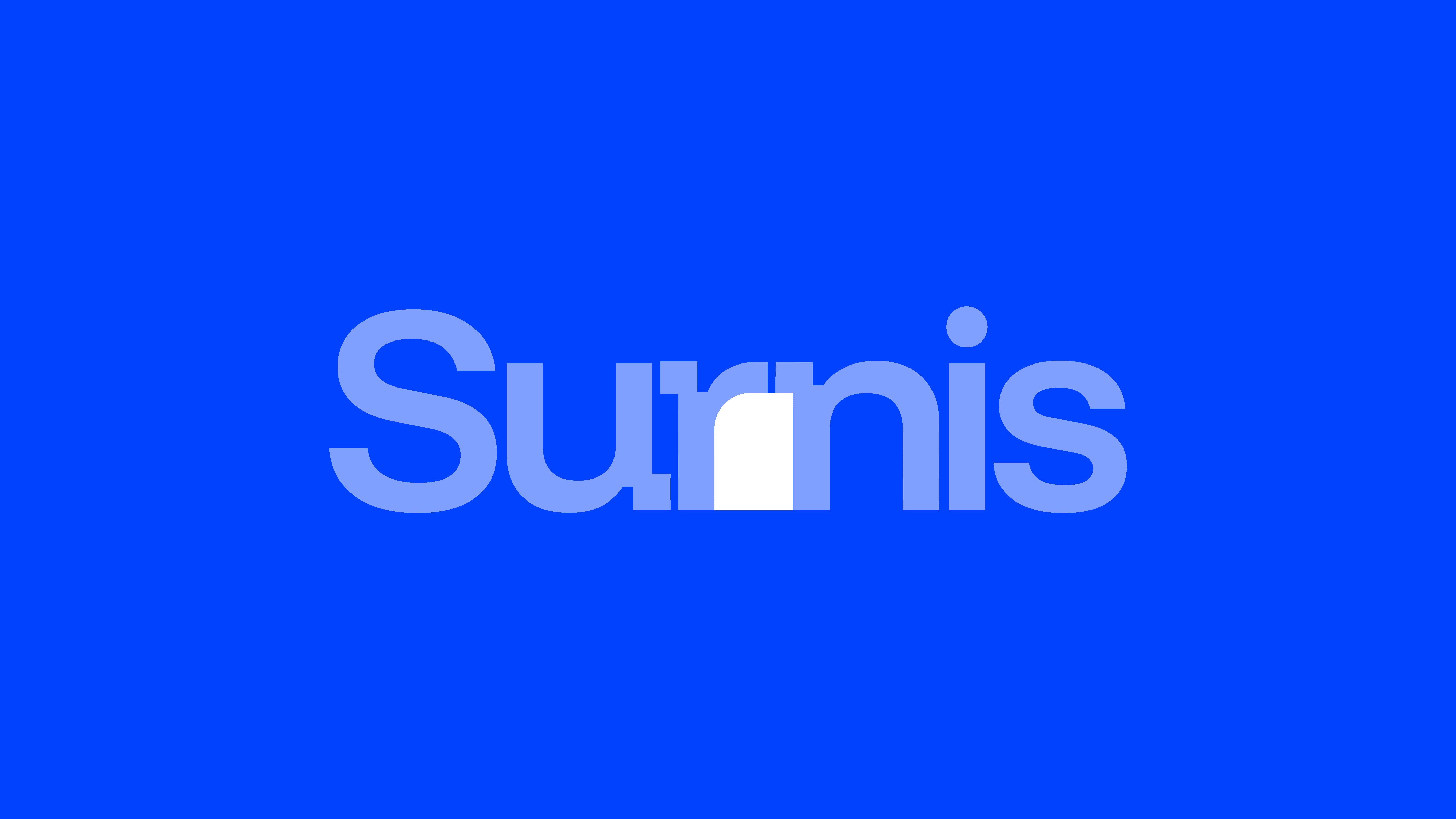
Furthermore, to maintain a sense of visual harmony and consistency within the logotype of Surnis, we made a deliberate adjustment to the type construction. While exploring the negative space created between the “r” and the “n”, we discovered that the form of the “n” carried potential for deeper storytelling, it subtly introduced a homely, apartment-like silhouette in its spacing.
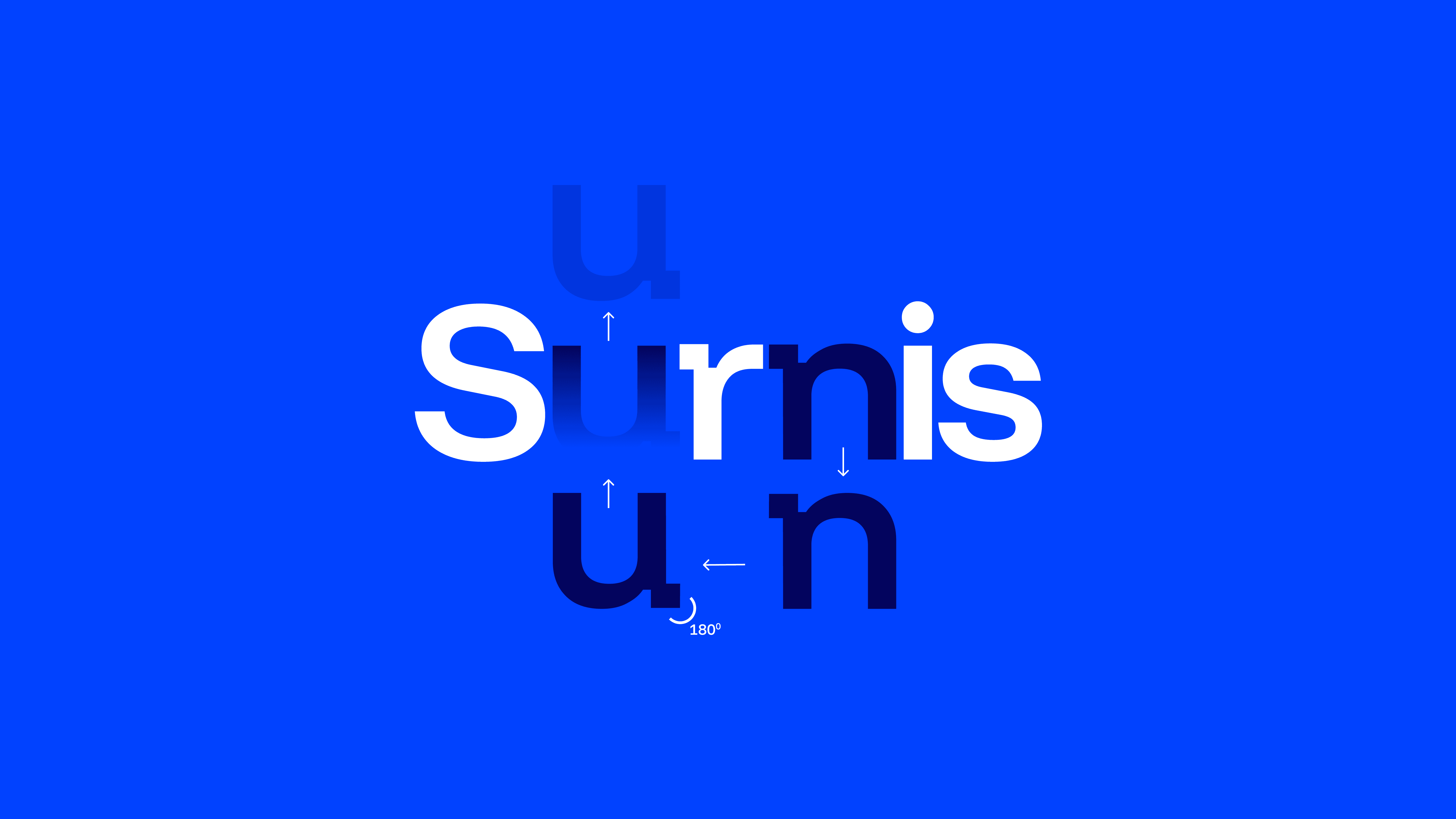
To carry this visual rhythm across the entire wordmark, we decided to reuse this same “n” form to replace the original “u” in Surnis. By rotating the “n” 180 degrees, it naturally transformed into a “u”-like shape. This worked seamlessly because the “n” and “u” share inherent structural similarities. However, the “u” traditionally has a slightly more open internal curve than the “n,” so we made subtle refinements to balance that difference, ensuring the letter felt intentional rather than forced.
This adjustment not only preserved the integrity of the logotype but also introduced a layer of design consistency and attention to detail. The reinterpreted “u” aligns with the narrative of transformation, taking an existing form, rethinking it, and reshaping it into something new, just as Surnis aims to transform and refine spaces.
The Process
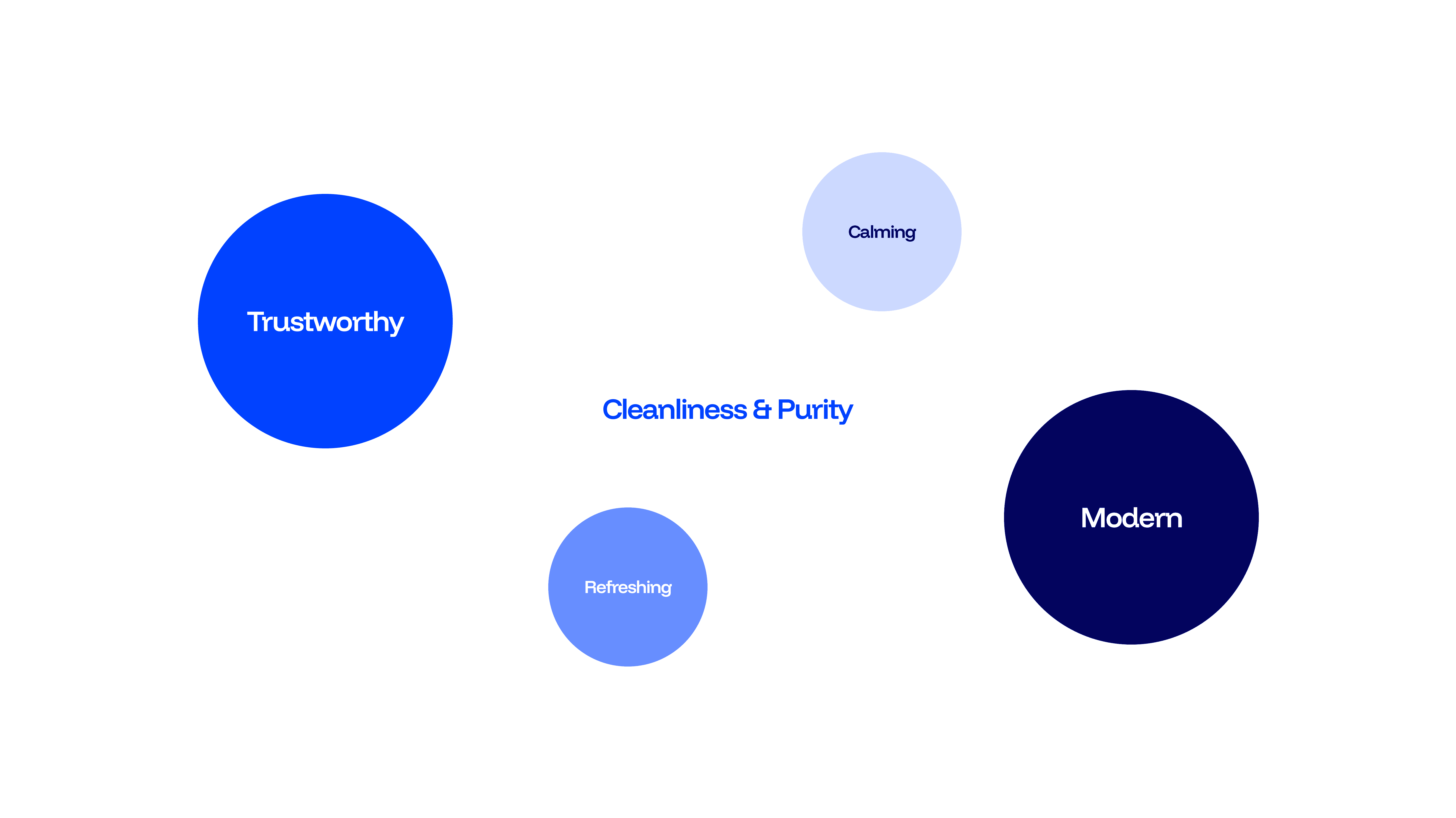
Hues of Purity & Trust
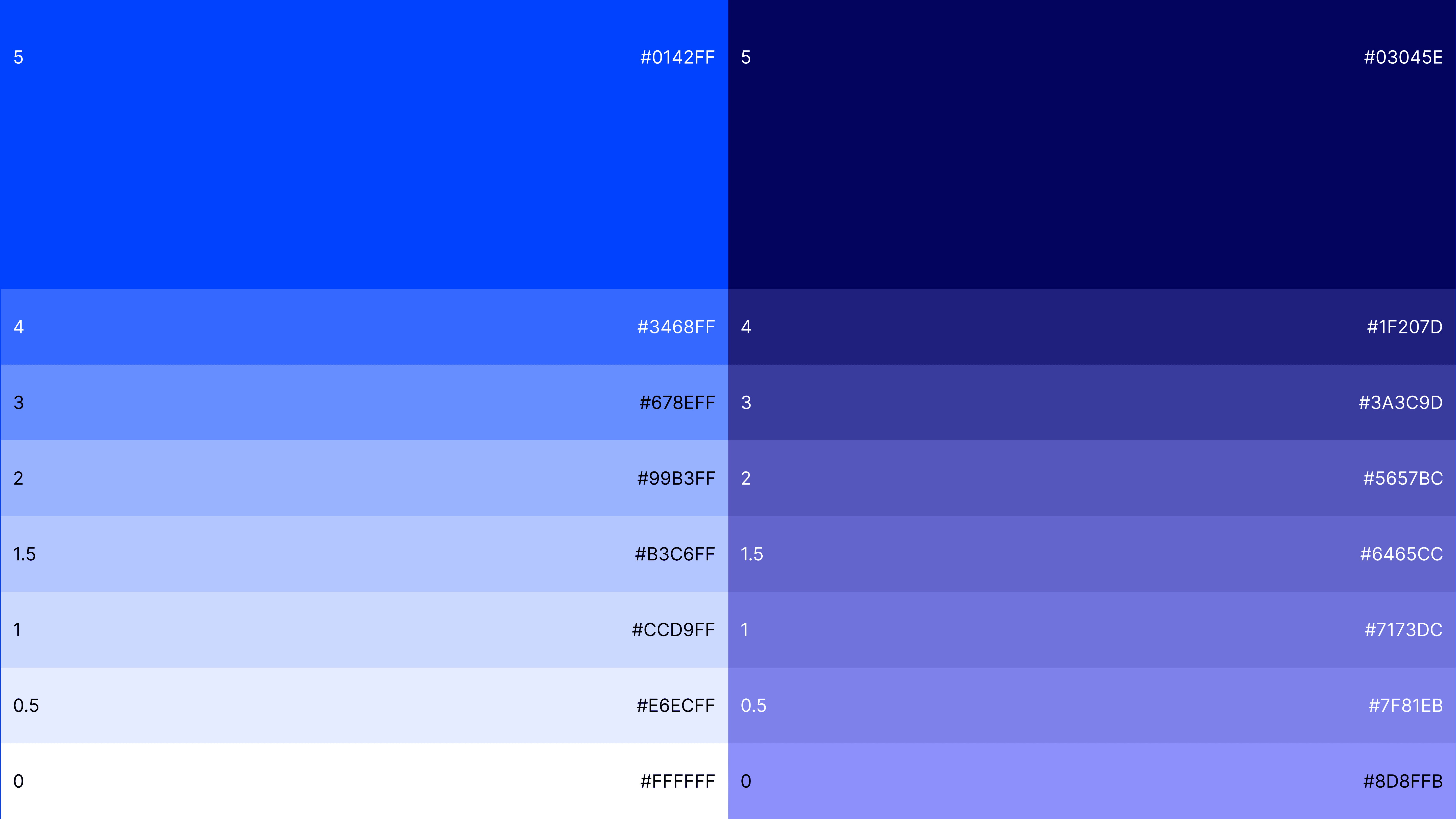
For Surnis Brand colour direction, we established a monochromatic system of blue shades that balances vibrancy with professionalism. The palette is structured around two core anchor colours:
Primary Blue (#0142FF) – the main energetic and bold shade that captures attention.
Deep Navy (#03045E) – a darker, grounding counterpart that adds stability and contrast.
From these anchors, lighter and darker tints are systematically derived, ranging from 0.5 to 5 increments, allowing for flexibility across different use cases such as backgrounds, gradients, UI elements, or brand illustrations.
This gradient progression ensures scalability and adaptability, lighter tones work well for highlights and secondary text, while darker tones provide structure and depth. The consistent tonal harmony within the palette guarantees a cohesive visual identity, whether applied in digital or print environments.
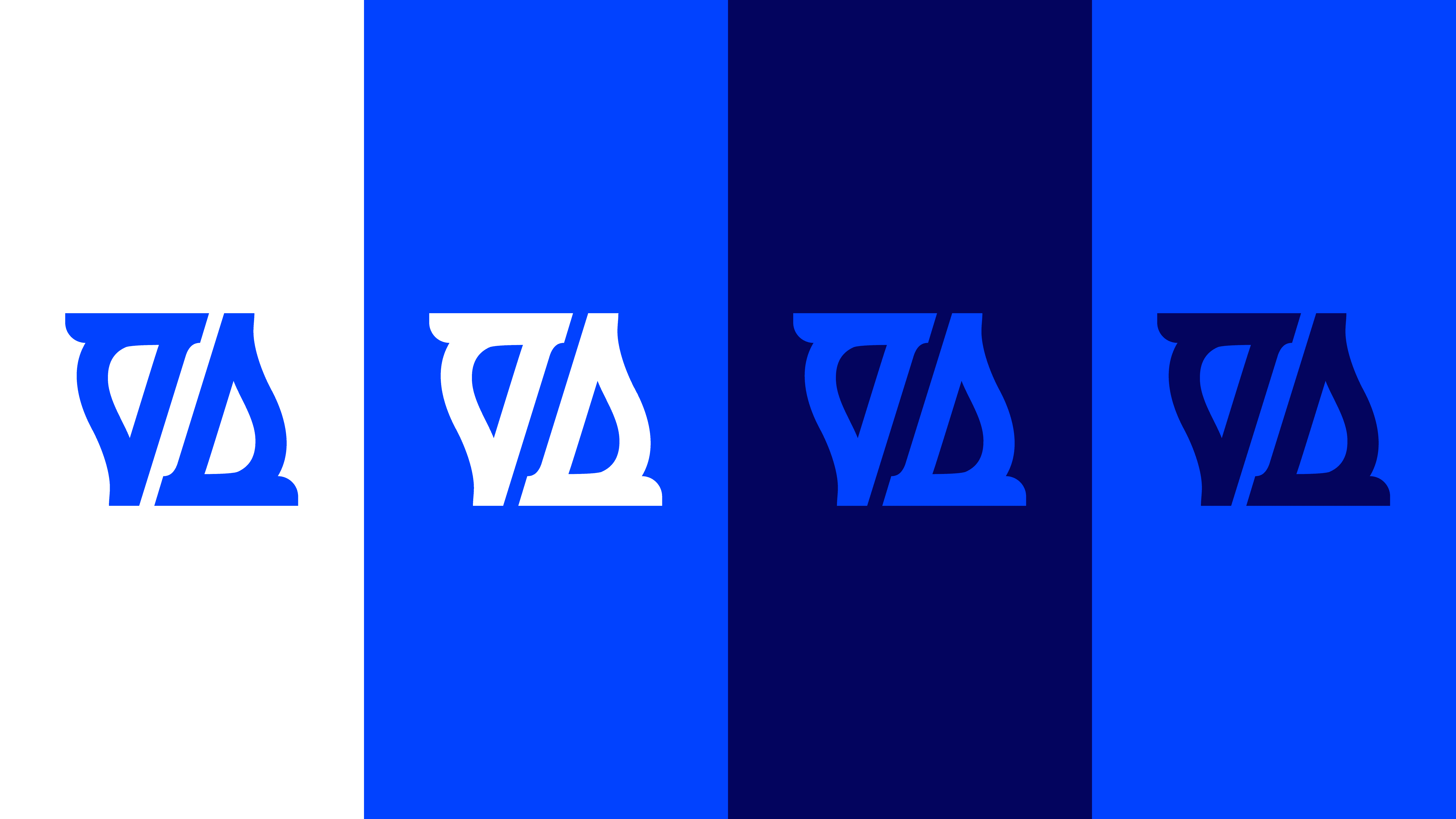
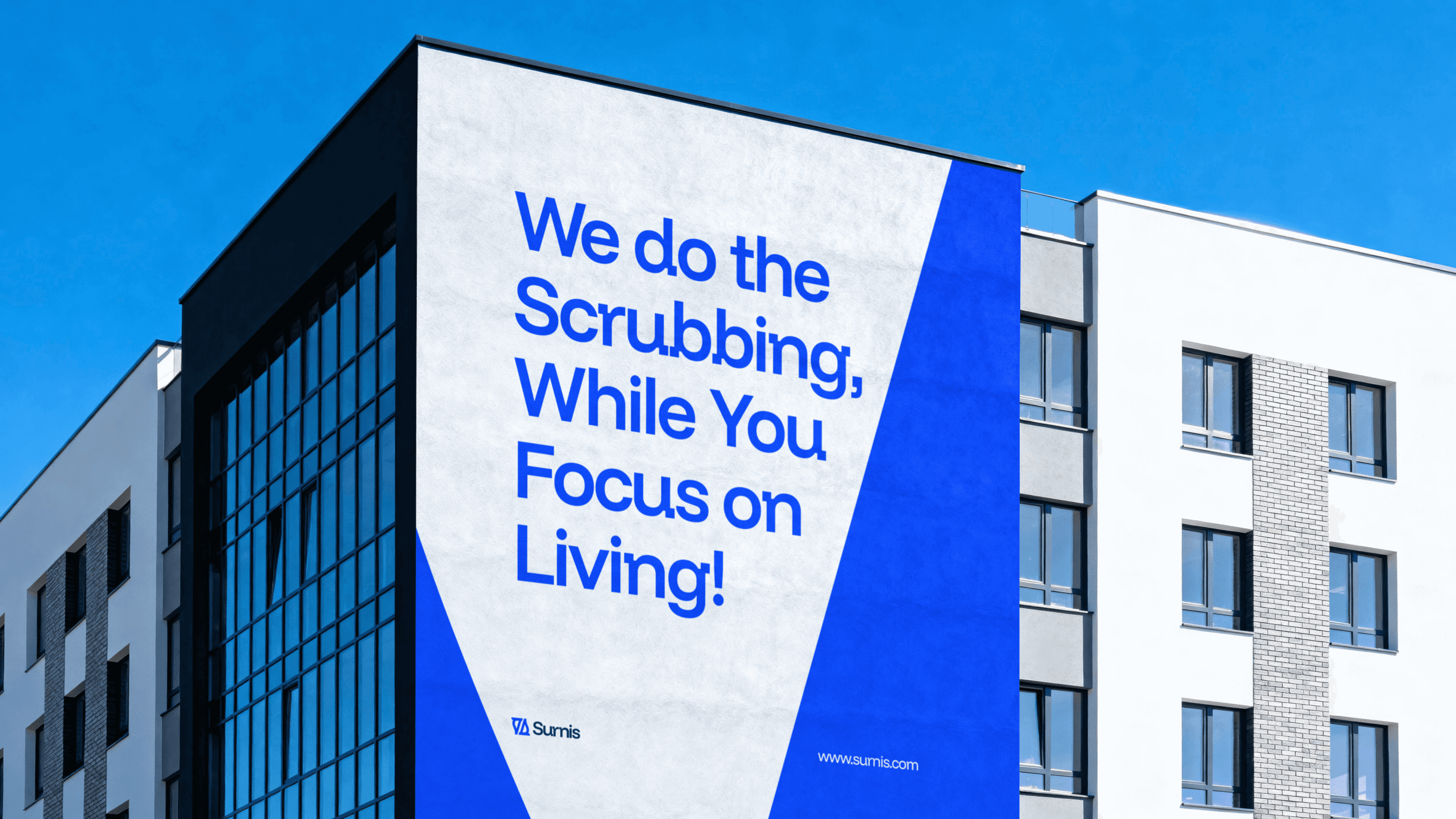
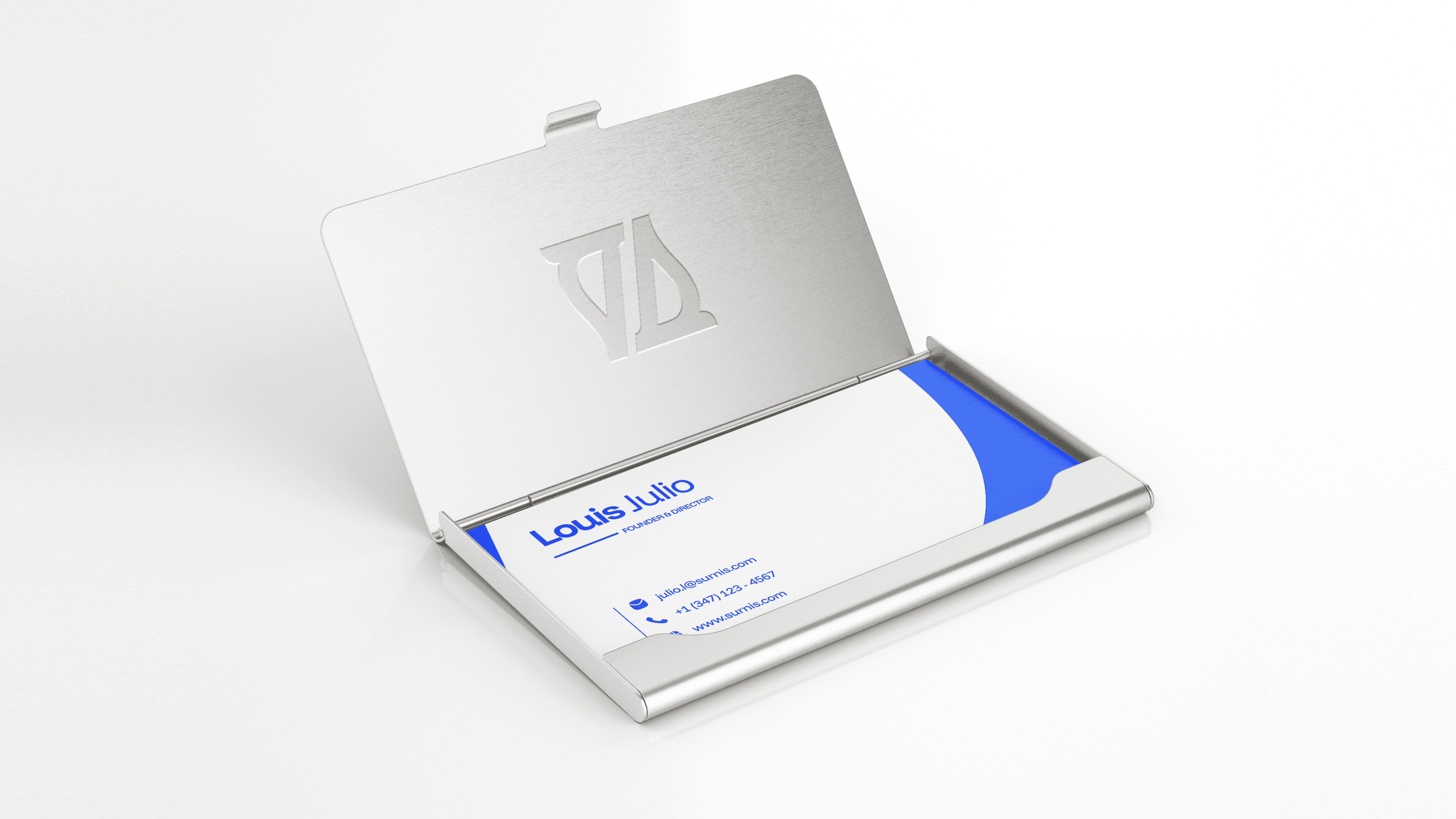
Logo Application with Colours
The logo system is designed to adapt seamlessly across the palette. Depending on context, the mark can appear in primary blue on white, white on blue, navy on blue, or blue on navy.
This ensures the brand identity remains instantly recognizable while still being flexible enough to adjust for contrast, legibility, and accessibility across different media and background applications.
The interplay of light and dark variants reflects both the dynamic and stable aspects of the brand, ensuring the mark feels equally bold in energetic settings as well as in more professional, subdued applications.
Results
A Brand Built to Last
The Surnis identity has evolved into more than just a logo, it has become a visual system that embodies clarity, trust, and professionalism. Through careful refinement of its typeface, balanced use of negative space, and a tailored colour palette rooted in shades of blue, Surnis now communicates its core values with confidence and style.
The result is a distinctive and scalable brand identity that feels modern, approachable, and memorable across all applications, from digital to physical touchpoints. It bridges the gap between functionality and aesthetics, ensuring that Surnis is not only recognized but also trusted and remembered.


Prev Project

Next Project
