Meditation, Wellness & Fitness | 2022
Task at Hand
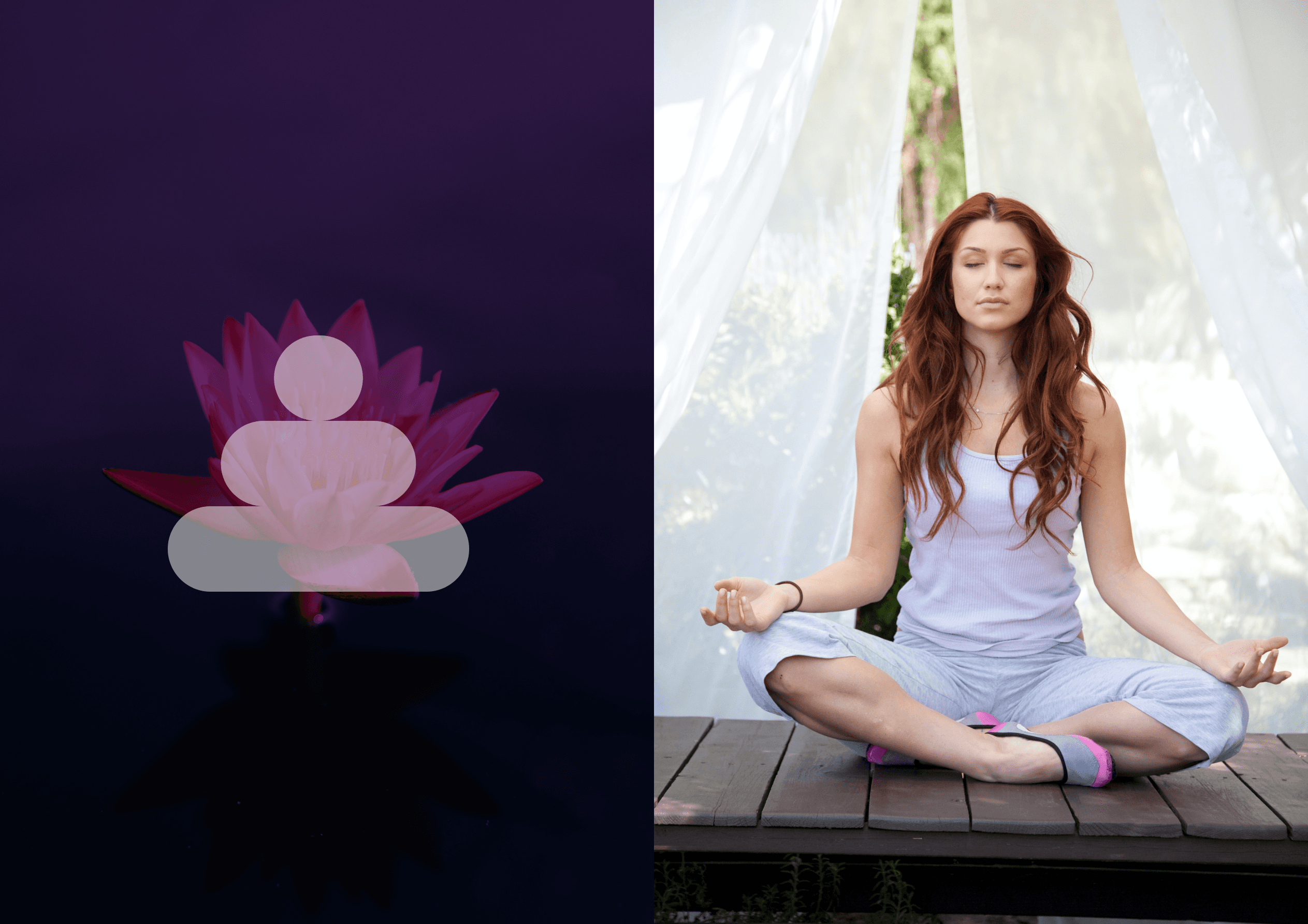
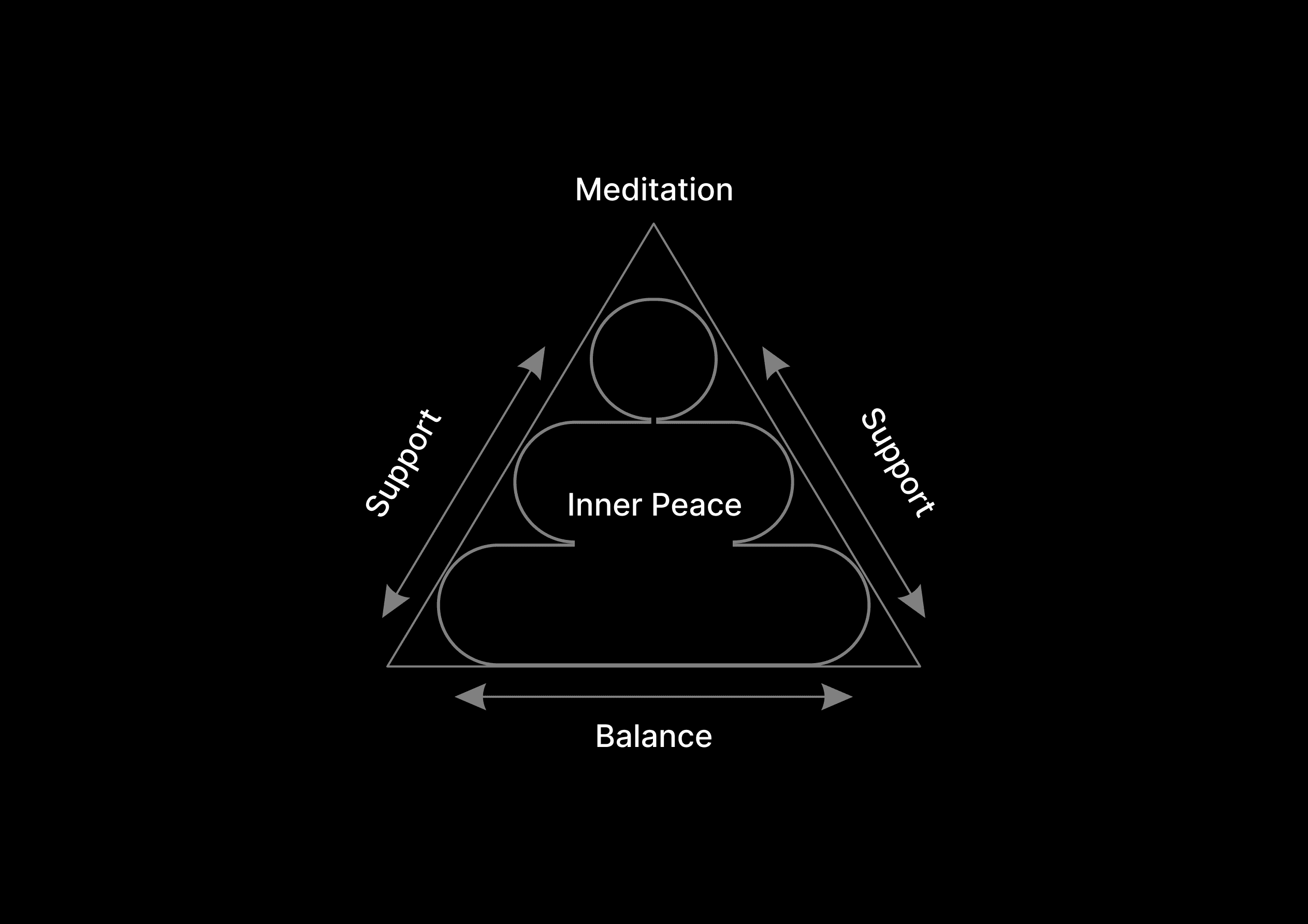
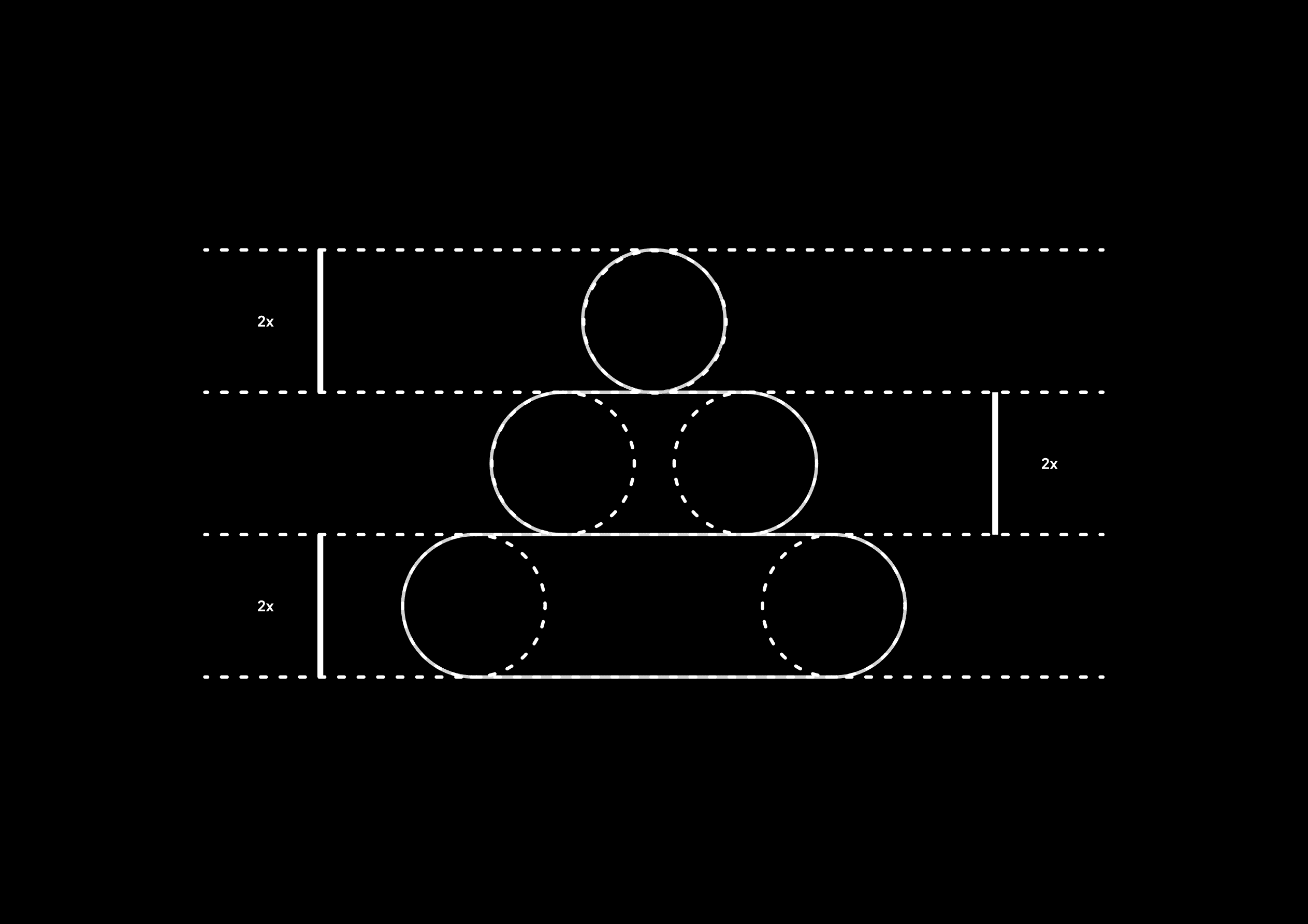
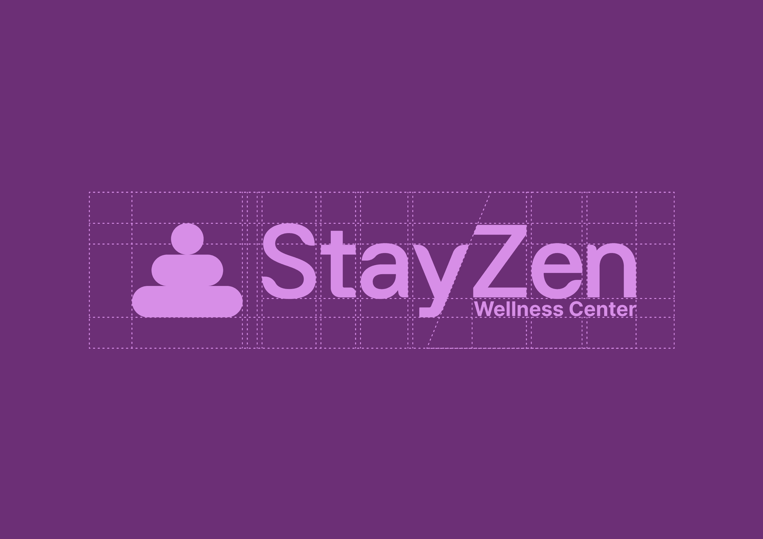
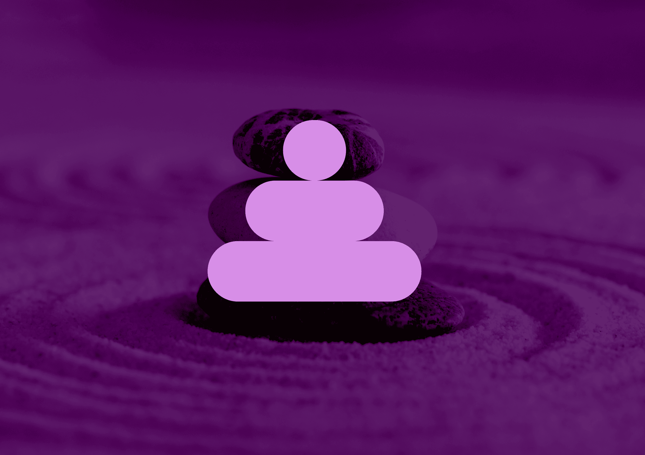
The challenge of the Brand Identity Design project was to create a logomark that reflects the core attribute of the brand, which is BALANCE. It was crucial to ensure that the logomark embodies accuracy and attention to detail to provide a sense of depth and complexity that aligns with the brand's vision. The objective was to develop a logomark that effectively communicates the following aspects:
Emotional BALANCE.
Psychological BALANCE.
Mental Health BALANCE.
Meditation.
Community.
Support.
Togetherness.
Love.
Redefined Approach
By addressing these considerations, I aimed to develop a unique and impactful brand identity that resonates with the target audience and conveys the essence of BALANCE in emotional, psychological, and mental well-being, while encompassing the values of meditation, community, support, togetherness, love, and spirituality.
The logomark needed to visually encapsulate these elements while maintaining a sense of balance and precision. It was vital to create a design that captures the attention of the target audience and evokes a feeling of trust and serenity.

We Delivered
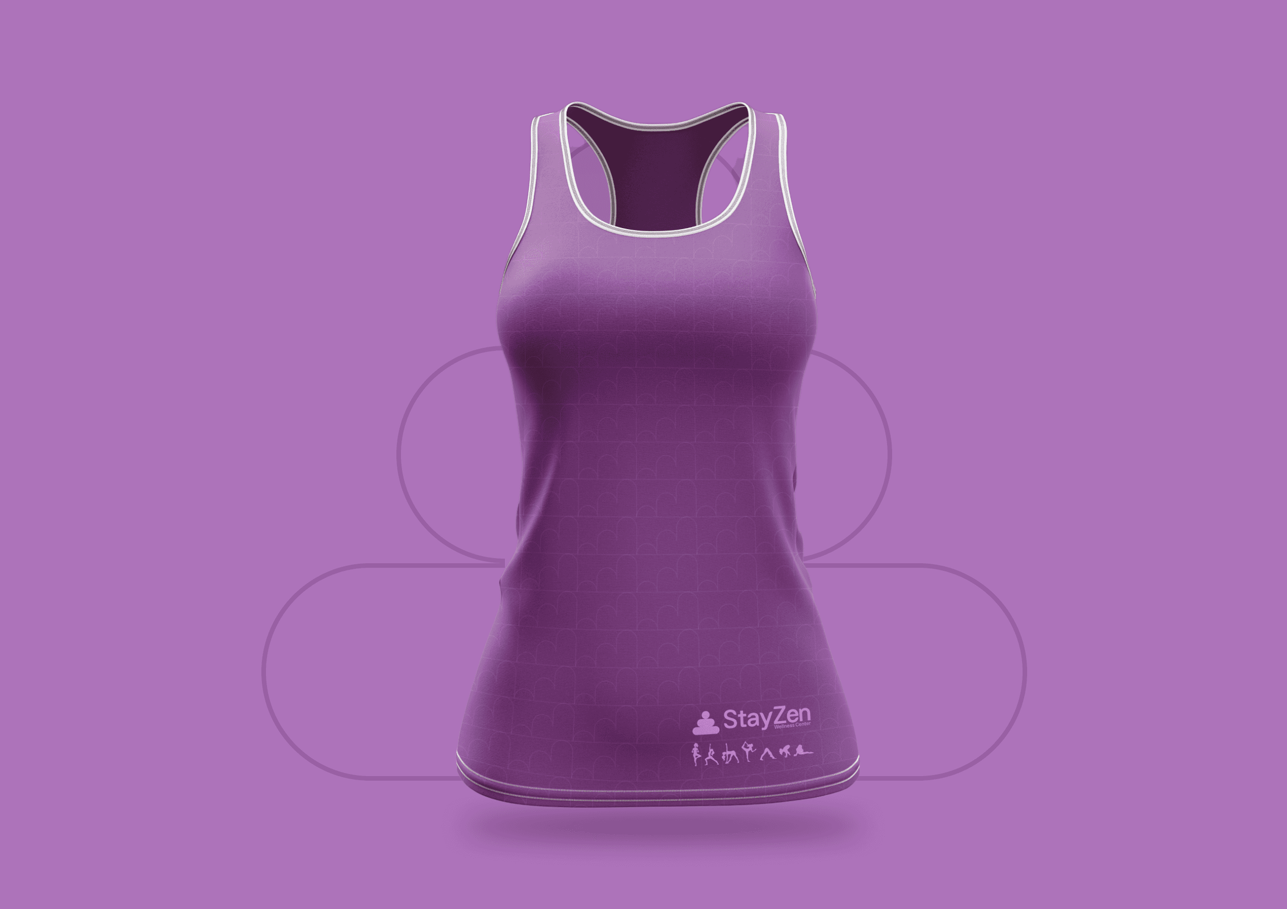
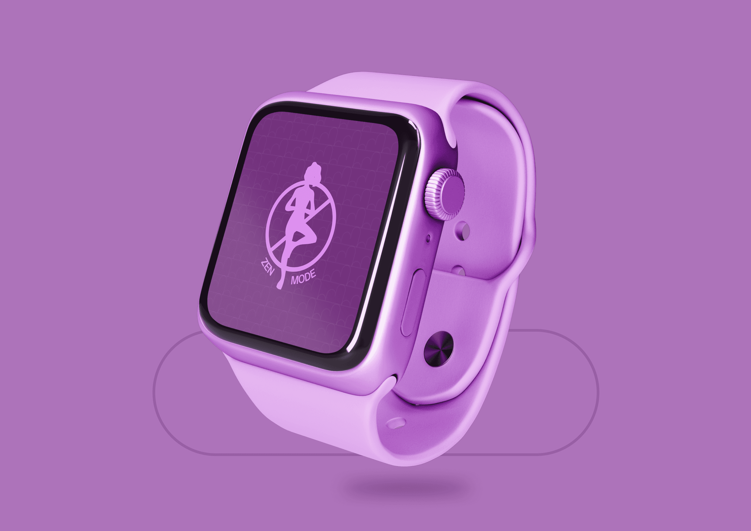
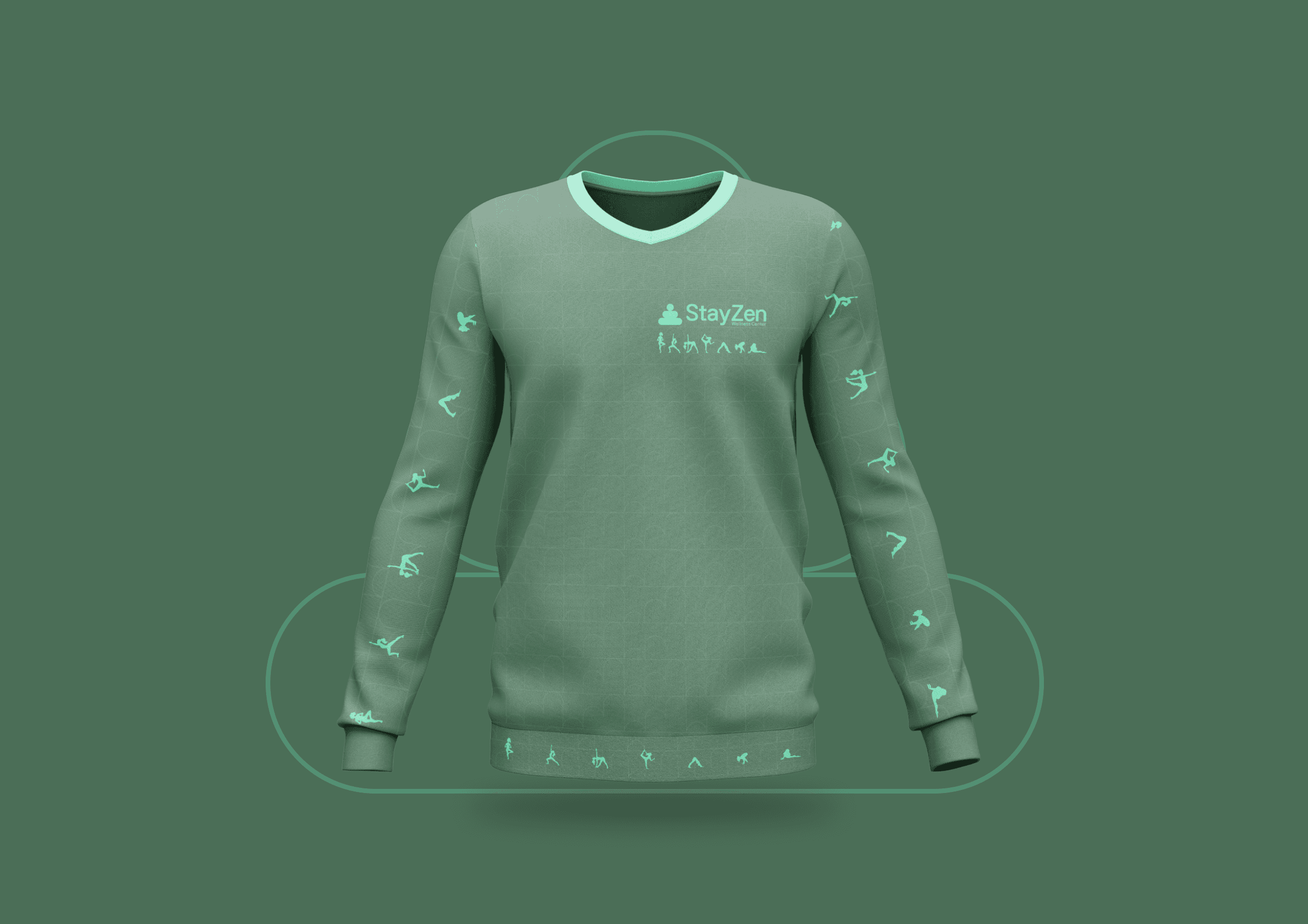
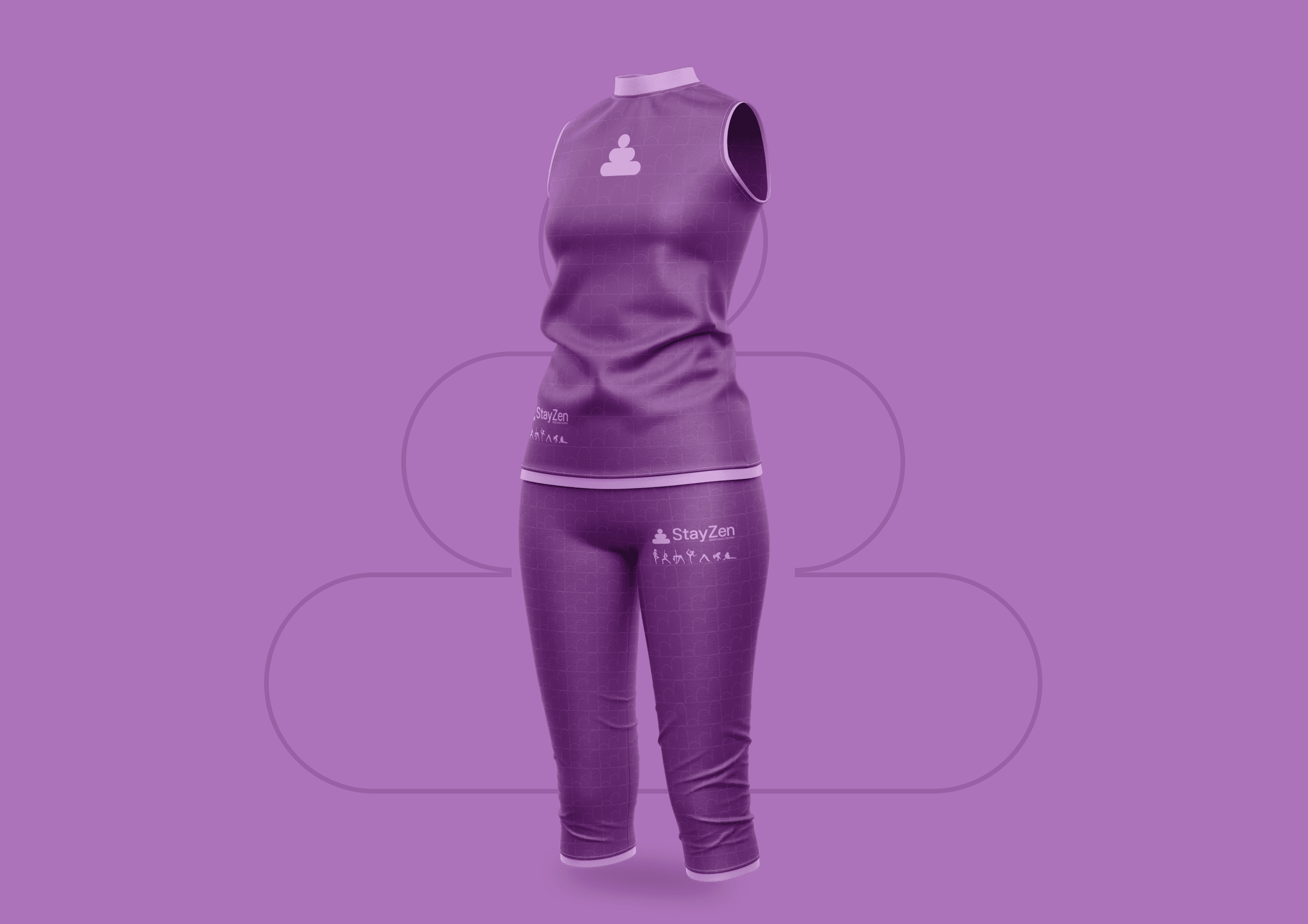
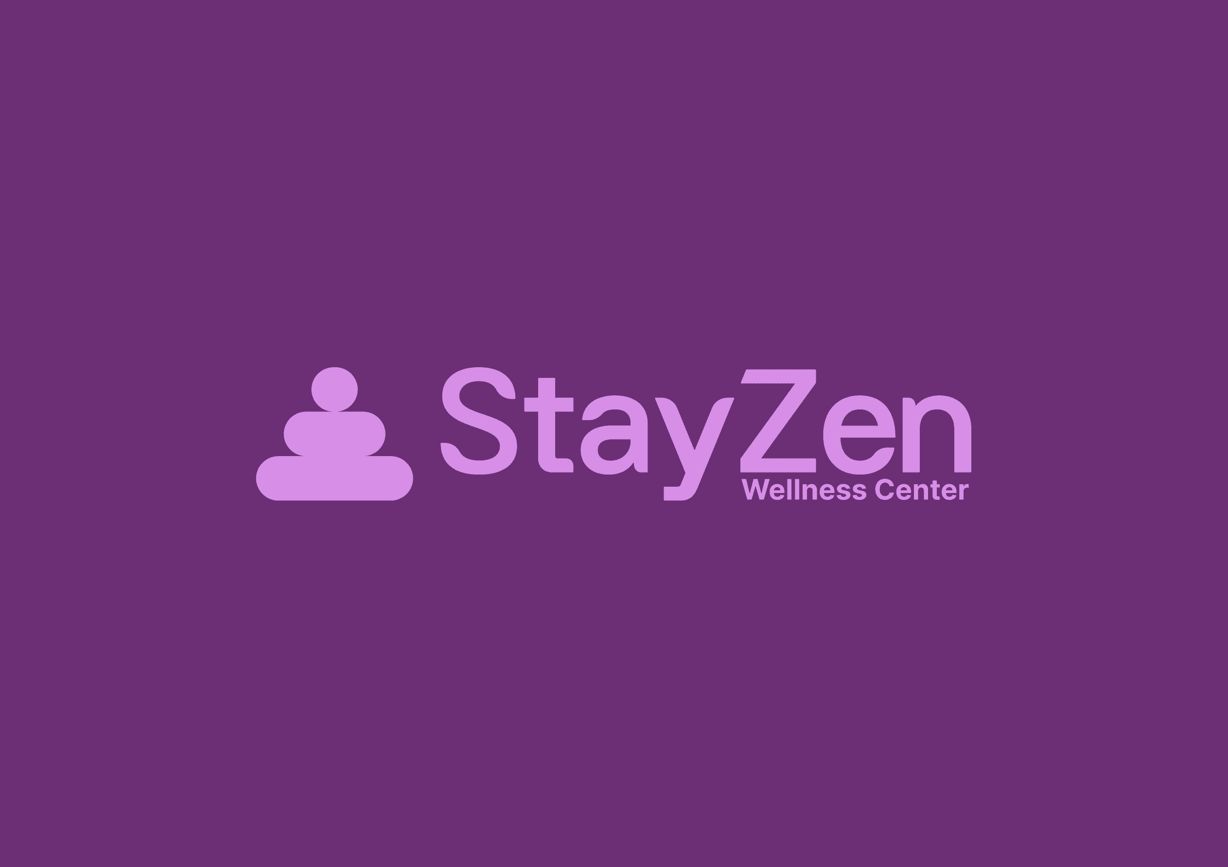
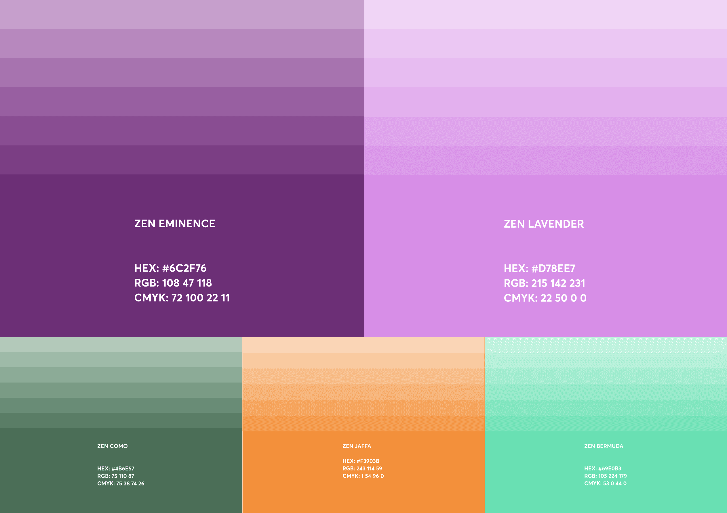
The successful StayZen brand identity design project resulted in a captivating representation of balance, calmness, and femininity. The carefully curated colour palettes effectively convey the Inner Chi Vibe and emotions while communicating the brand's key message to the target audience. This visually engaging identity establishes StayZen as a trusted and empowering brand, making a positive impact on women's well-being.