Fitness | 2024
"Unnees designbureau heeft onze verwachtingen overtroffen bij het bouwen van onze website en branding. Hun creativiteit en professionaliteit zijn prijzenswaardig. Een absolute aanrader!"
Rachel L.
Redefined Approach
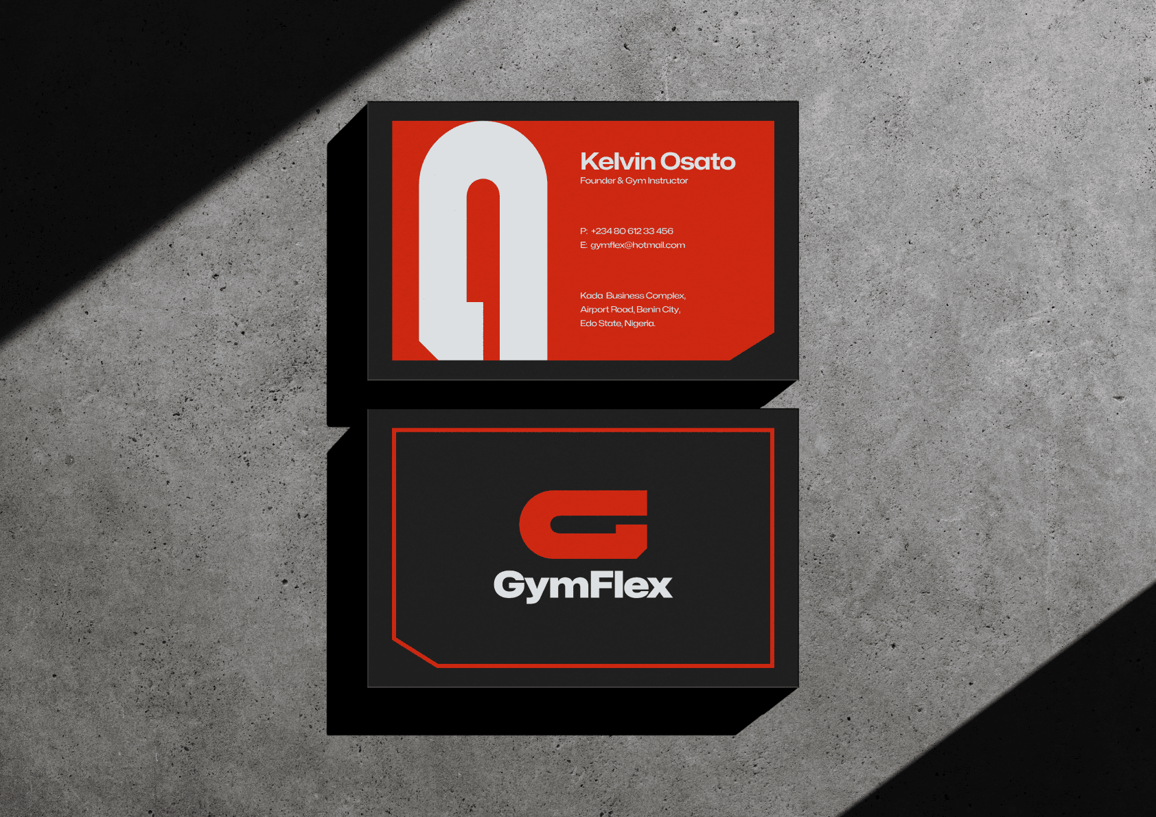
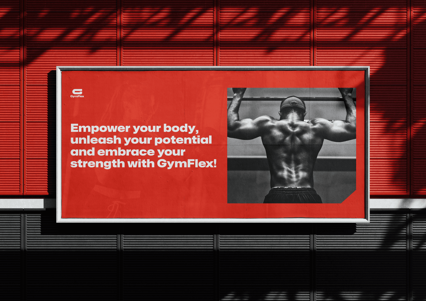
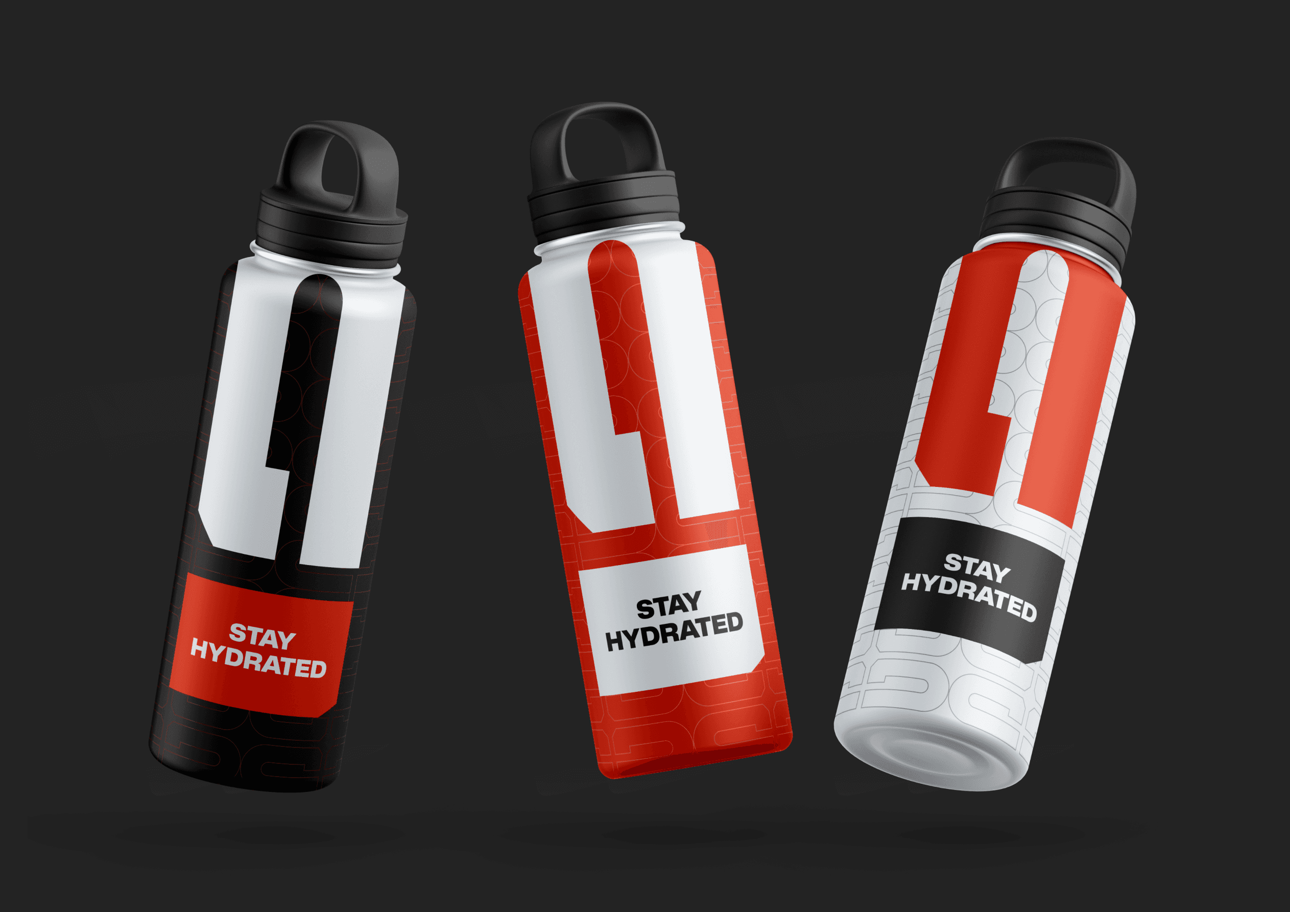
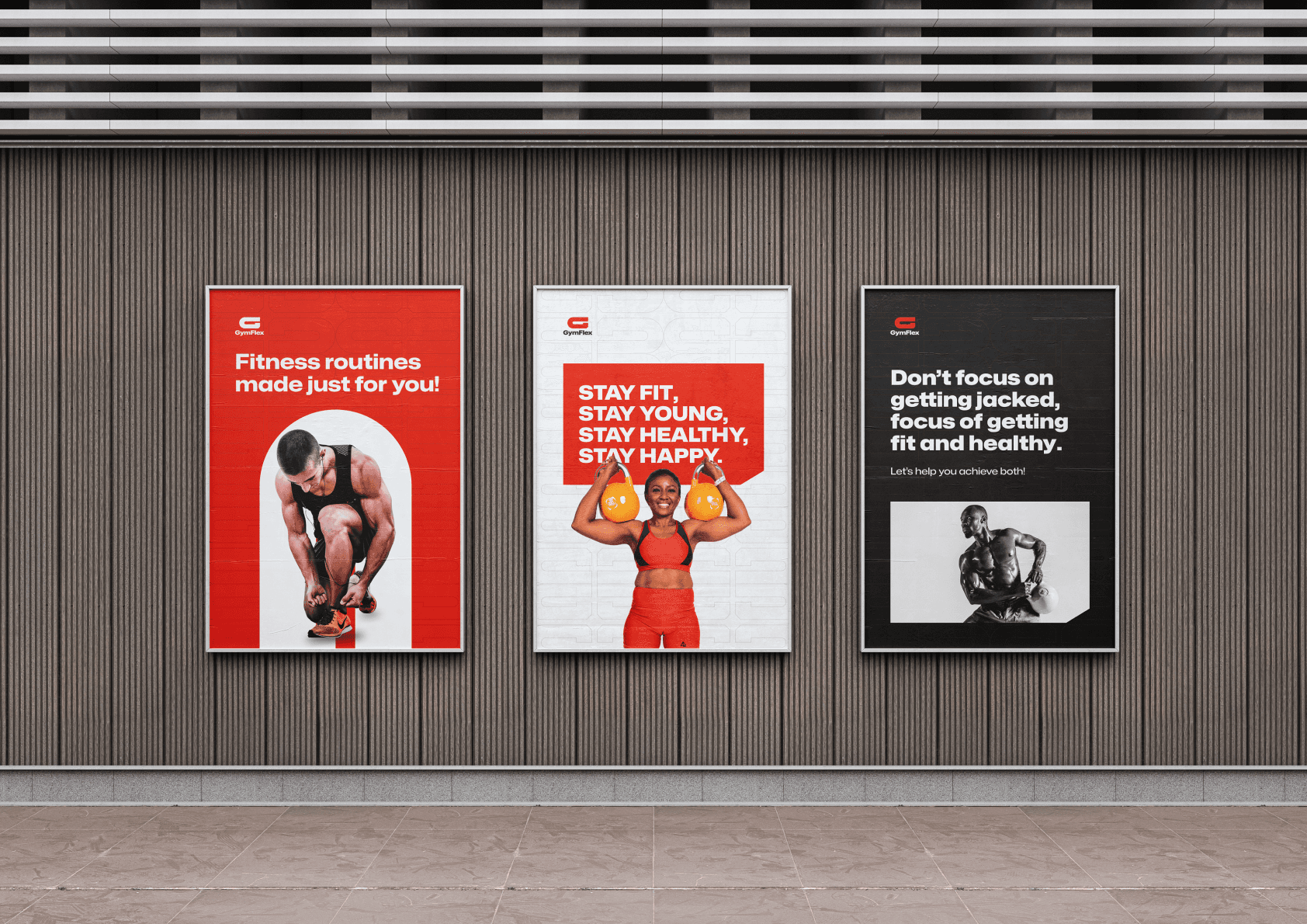
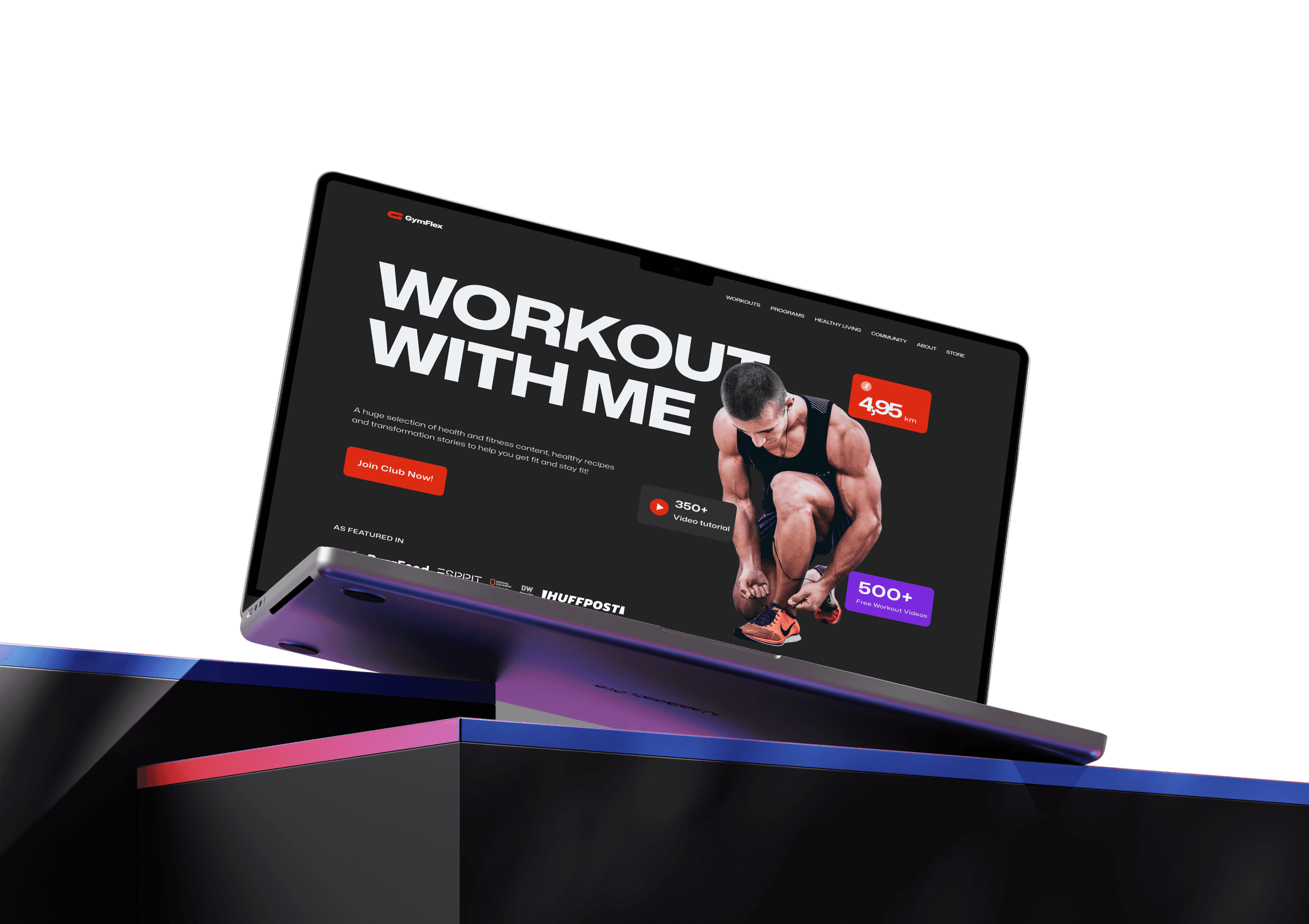
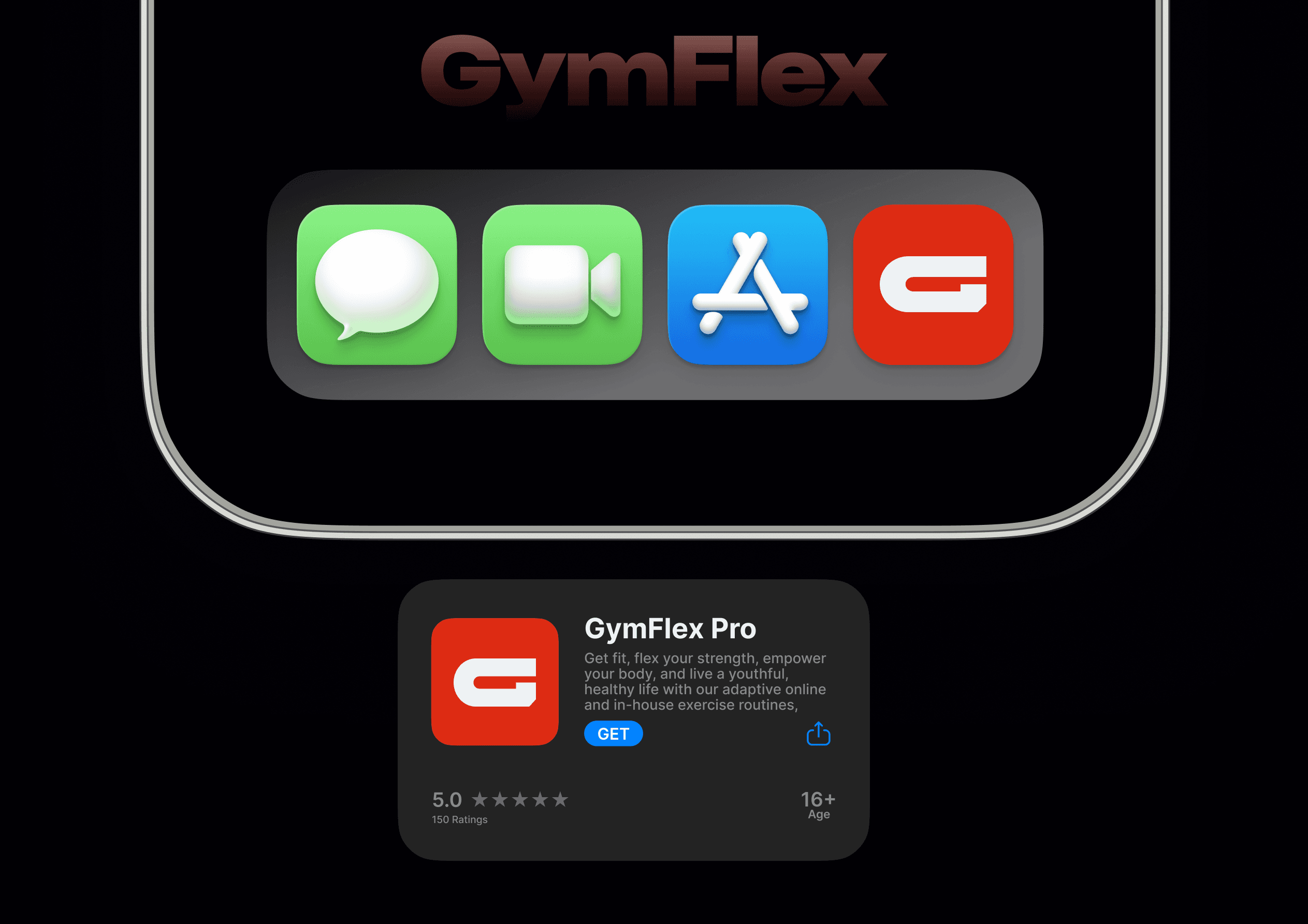
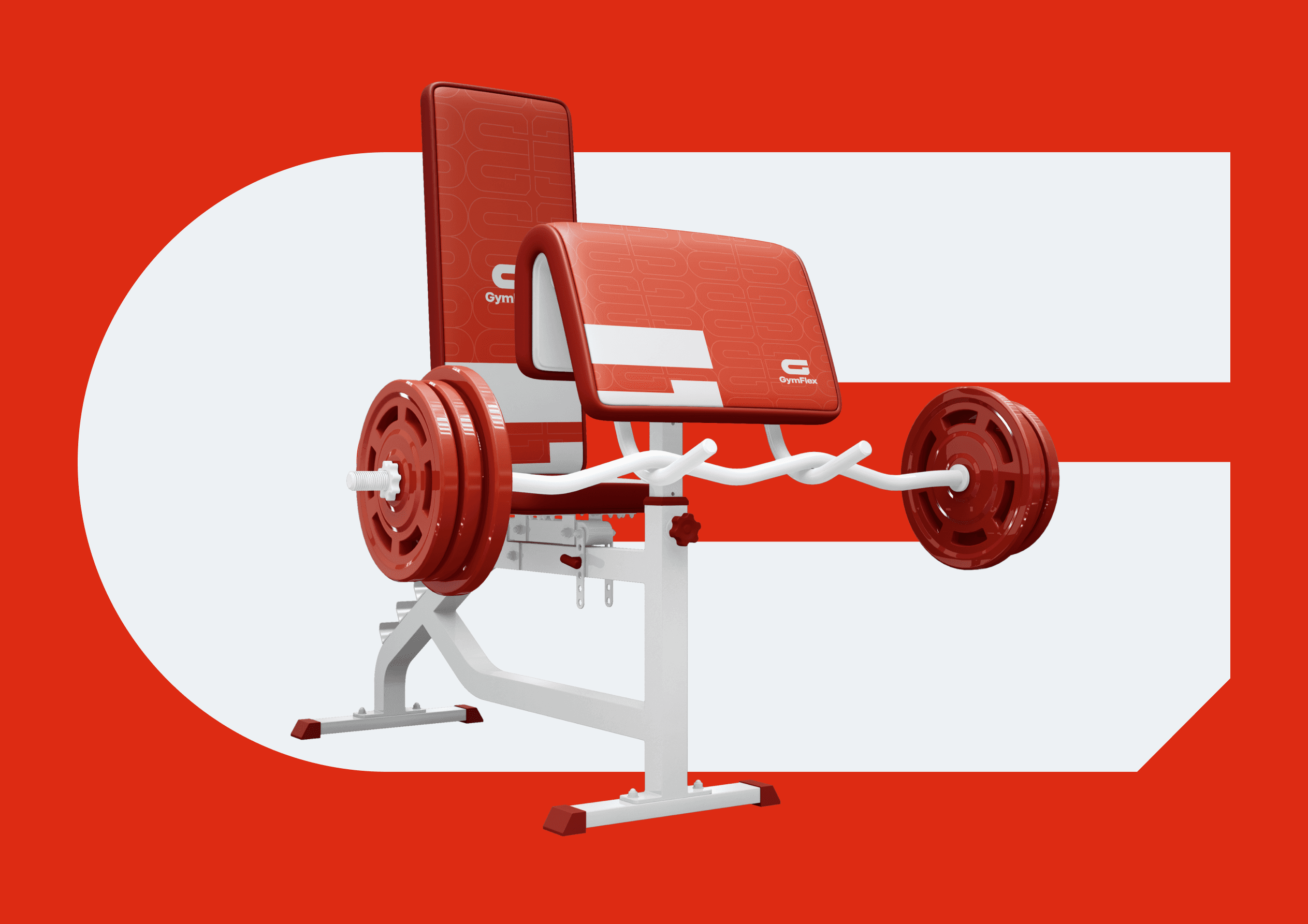
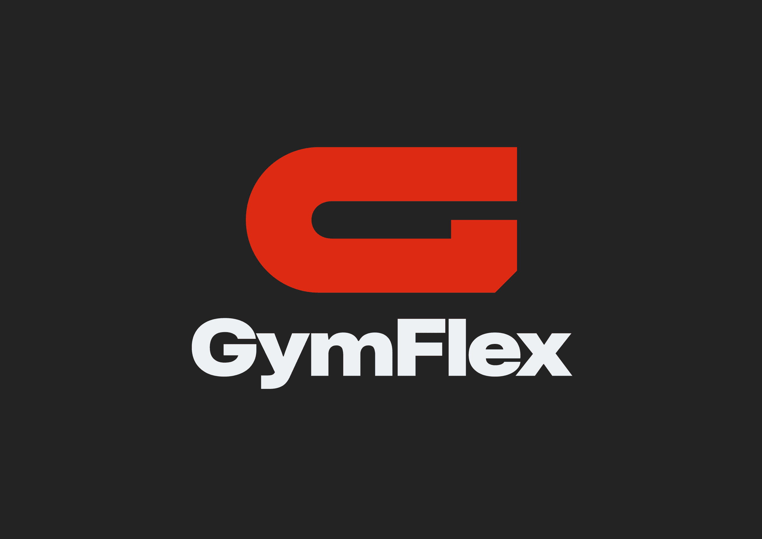
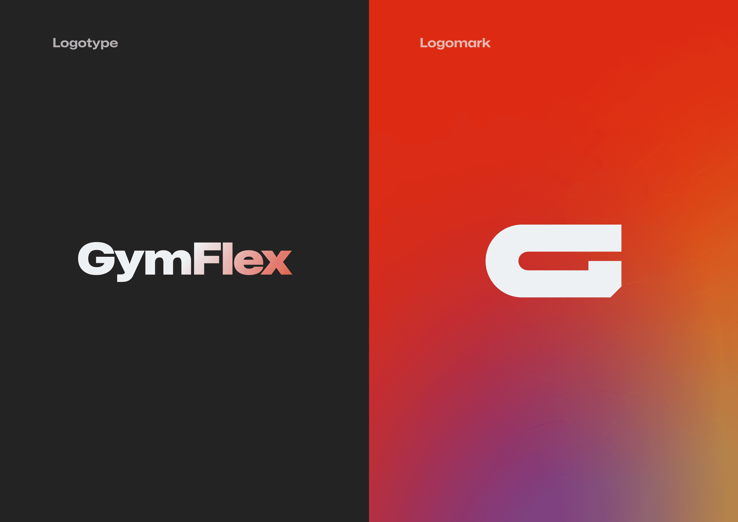
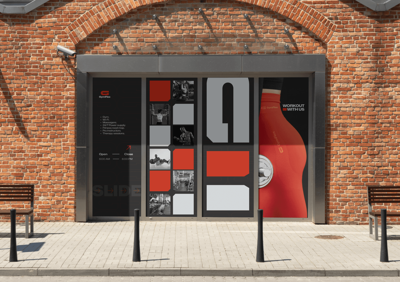
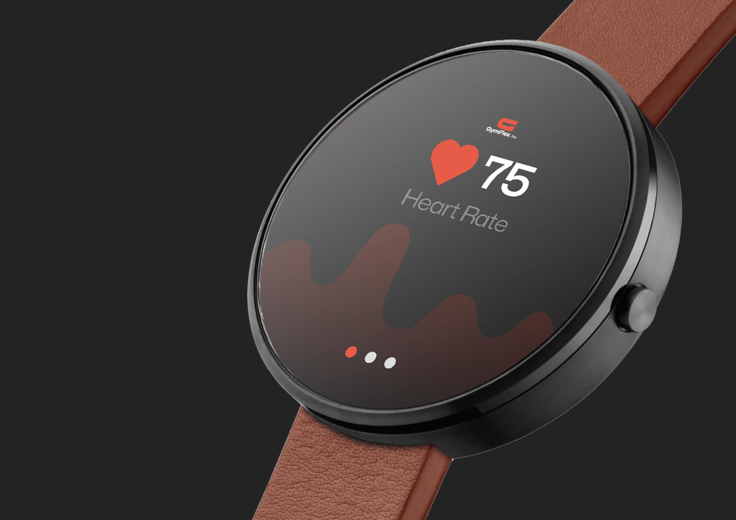
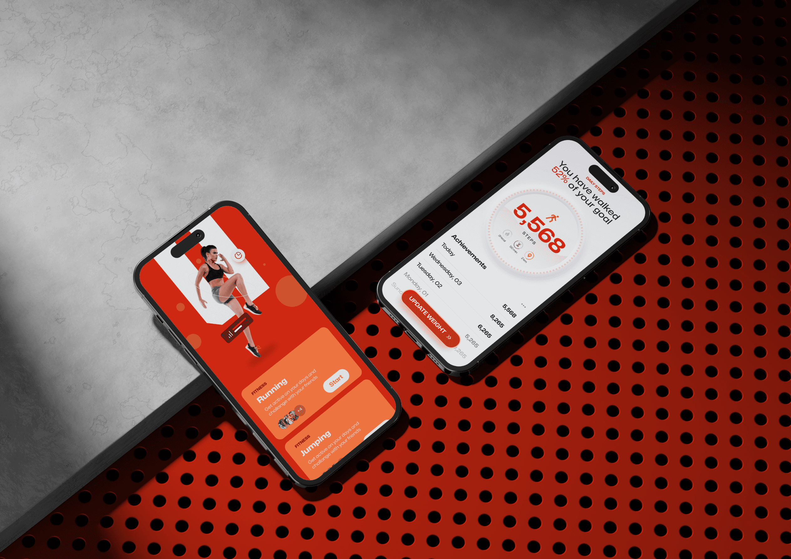
Enter GymFlex, where every angle and curve of the G-shaped geometric logomark is meticulously crafted to convey strength, agility, and determination. The brand identity exudes vibrancy and energy through a carefully curated colour palette that complements the dynamism of the fitness programs. The geometric precision symbolizes the structured approach to wellness, while the fluidity of the design reflects the adaptability inherent in the training methodologies. GymFlex's brand identity is a visual manifesto, communicating its commitment to sculpting not just bodies but empowering lifestyles.
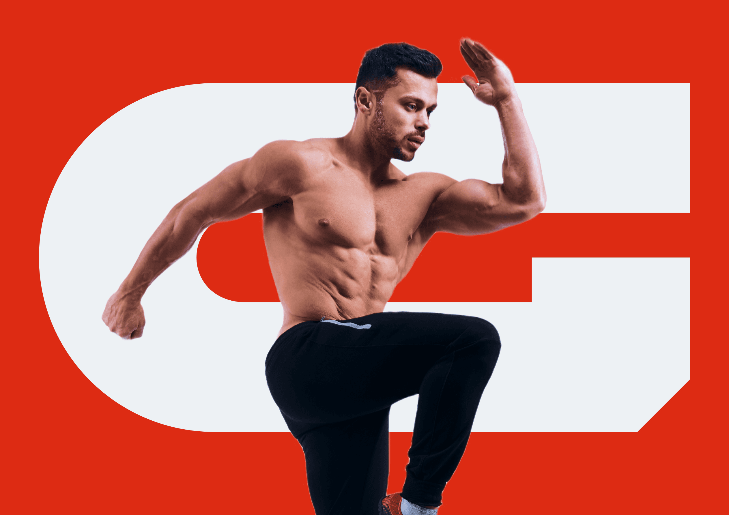
We Delivered
Choosing GymFlex means embracing a visual language that resonates with the essence of your fitness journey. The G-shaped geometric logomark becomes an emblem of dedication, transforming the way you perceive and approach wellness. The bold colours infuse vibrancy into your fitness experience, creating a visual synergy between passion and progress. GymFlex's brand identity ensures that every interaction, from social media posts to marketing materials, is a powerful reminder of the strength within you waiting to be unleashed. The result is a brand that not only inspires but becomes a seamless part of your fitness narrative, empowering you to flex your potential and redefine your limits. GymFlex isn't just a brand; it's a visual echo of your fitness triumphs and a symbol of the journey towards a stronger, more flexible you.